Pantone's New It Colors Have Happiness-Boosting Powers

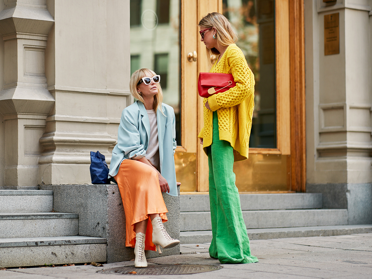
Since Pantone is the color-trend authority, we take the team's biannual reports as gospel. Today, Pantone Color Institute released its color trend report ahead of New York Fashion Week, highlighting the colors that will be dominant in the S/S 19 collections, which will, as a result, dictate the color trends for spring. You may be just starting to think of fall, but something to keep in mind is that as soon as the collections for the next season are shown, the fashion crowd starts wearing the new color trends before anything else.
For S/S 19, empowering, joyful colors compose the lineup of 12 trends, and just looking at them will make you happy. WWD reports that the leading five colors are powerful, attention-grabbing shades of red, orange, and pink.
"From a psychological standpoint, when you look at what the colors mean, the hotter colors particularly in the red family are all about empowerment," says Pantone Executive Director Leatrice Eiseman. "That's a word that has gotten some play that is really going to show itself in the spring collections. Confident, uplifting, joyful hues, but the undercurrent is empowerment to all of them."
Rounding out the 12 colors are a green, yellow, and cobalt blue described as "a way to have fun," plus a few spring-friendly neutrals. See all of Pantone's new trending colors in the report, and shop cool pieces in the happiest, most uplifting colors of the bunch below.
Living Coral
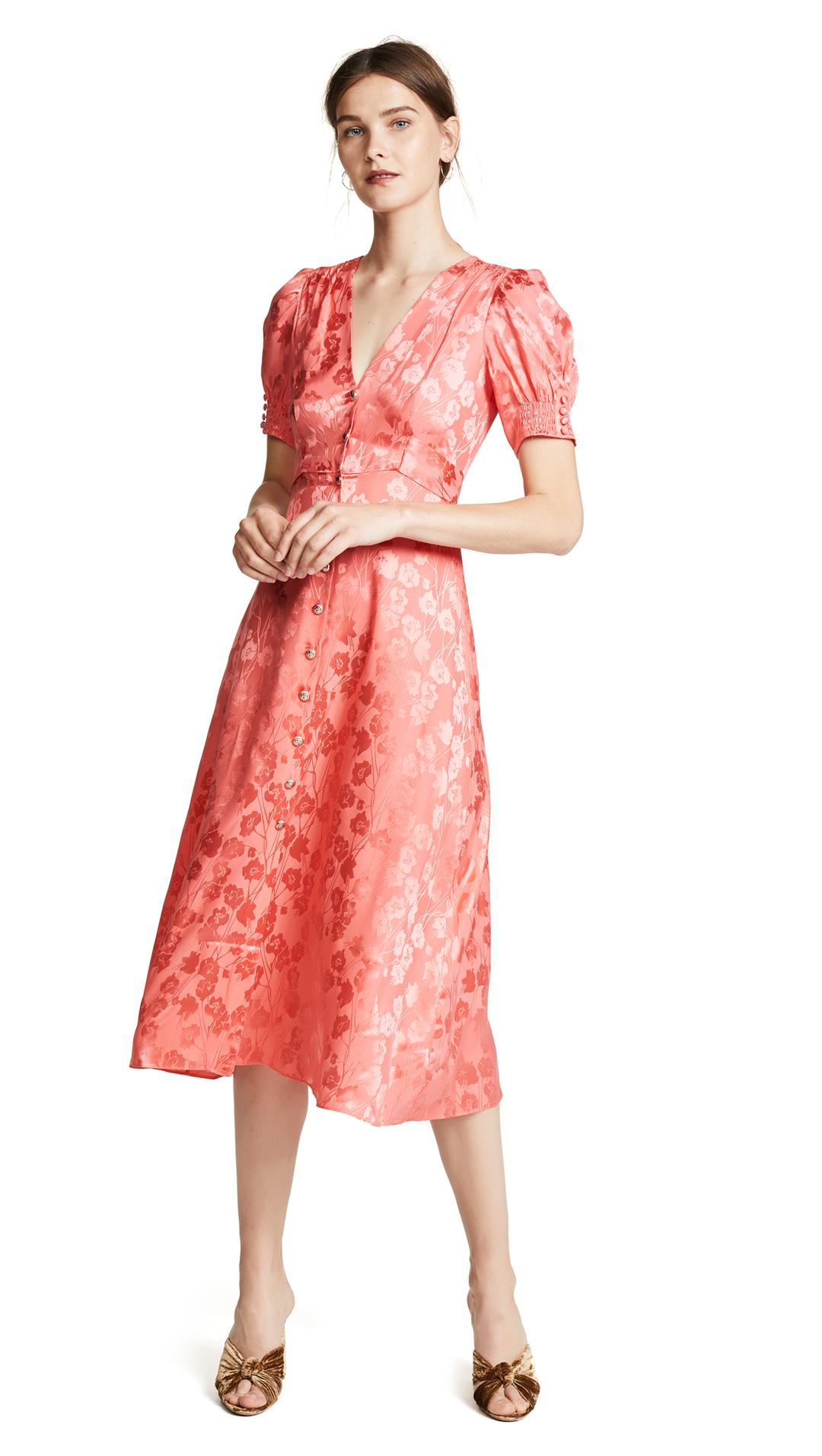
"An affable color with a proper edge, Living Coral still grabs attention but not as blatantly as orange does."—Pantone Color Institute
Pepper Stem
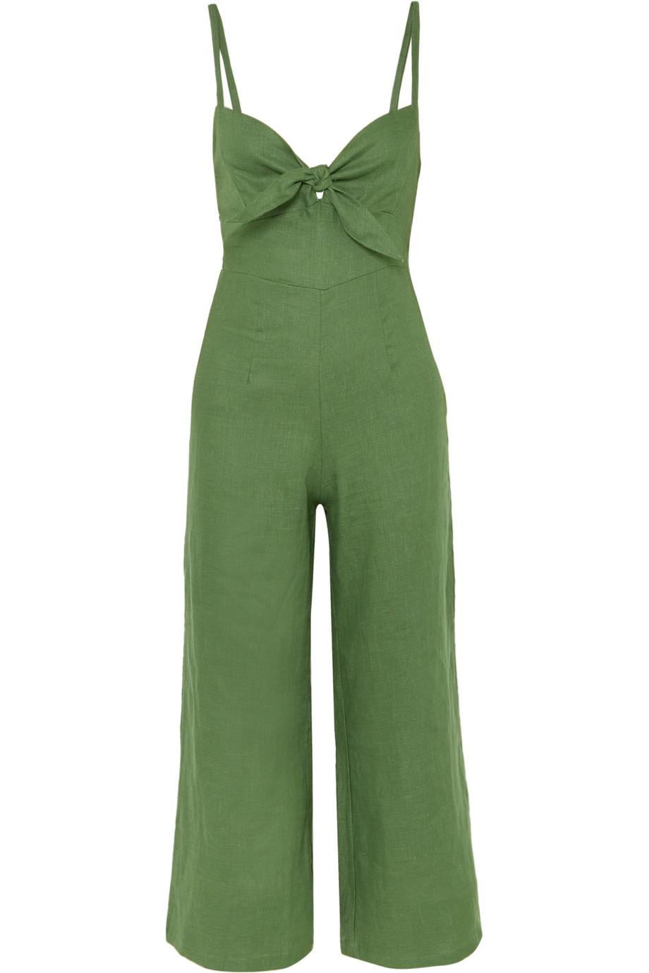
"Zesty yellow-green Pepper Stem encourages our desire for nature's healthy bounty."—Pantone Color Institute
Pink Peacock
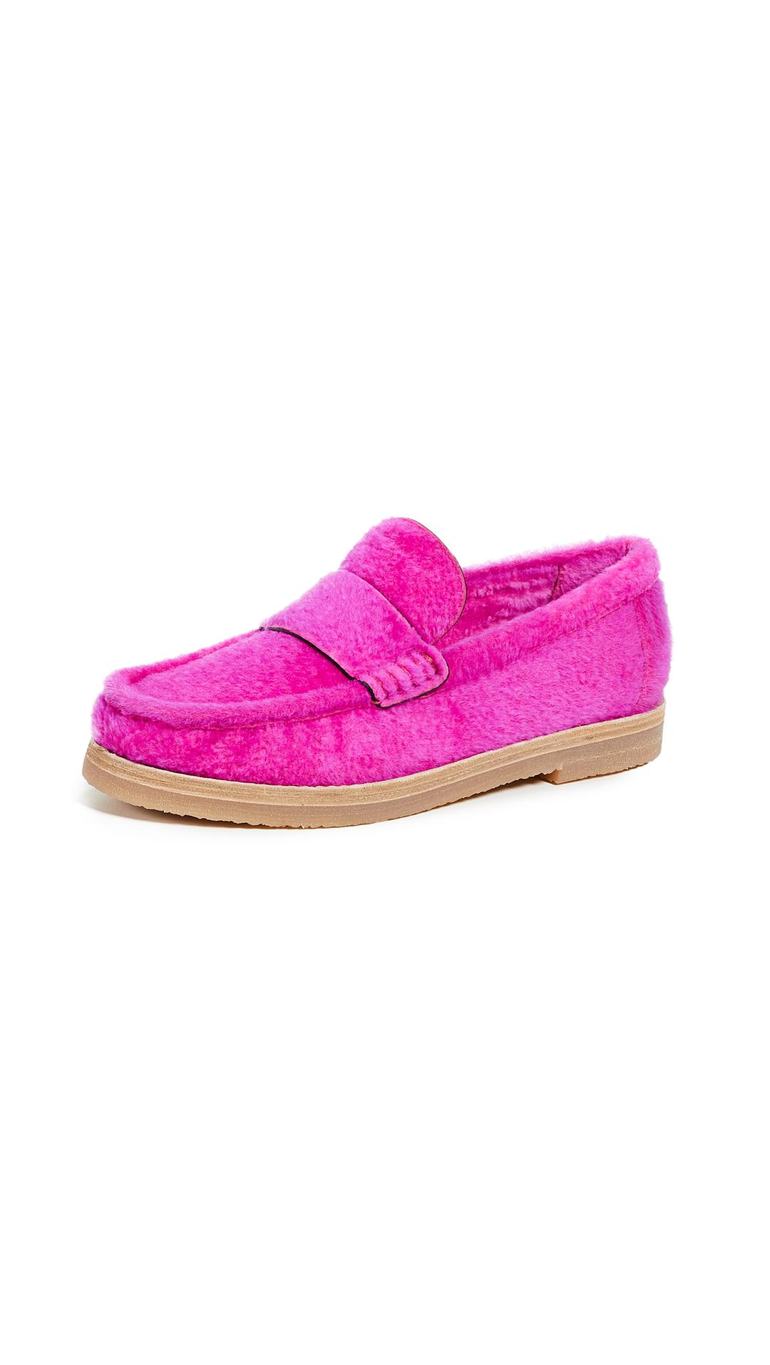
"The tantalizingly theatrical Pink Peacock fans out to a feast for the eyes."—Pantone Color Institute
Fiesta
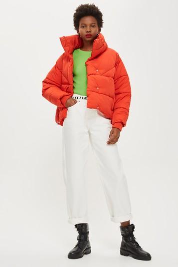
"A festive orange-red, Fiesta radiates energy, passion. and excitement."—Pantone Color Institute
Princess Blue
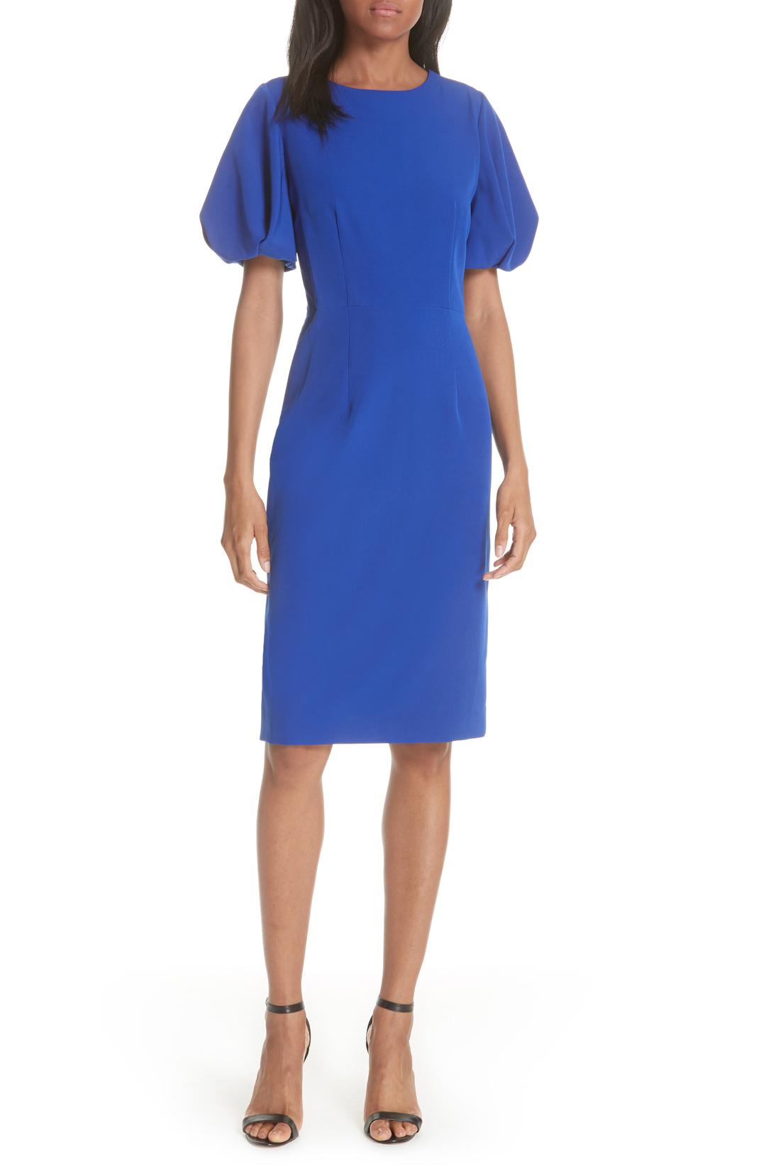
"Princess Blue, a majestic royal blue hue, glistens and gleams."—Pantone Color Institute
Aspen Gold
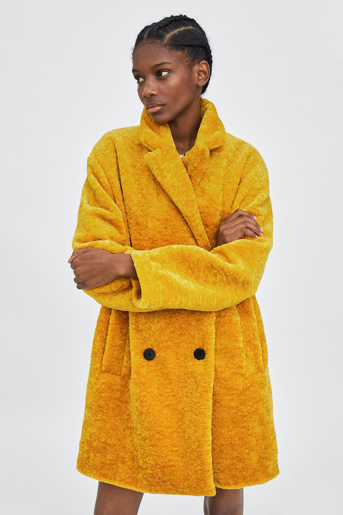
"Brightening our day, sunny Aspen Gold stimulates feelings of joy and good cheer."—Pantone Color Institute
Jester Red
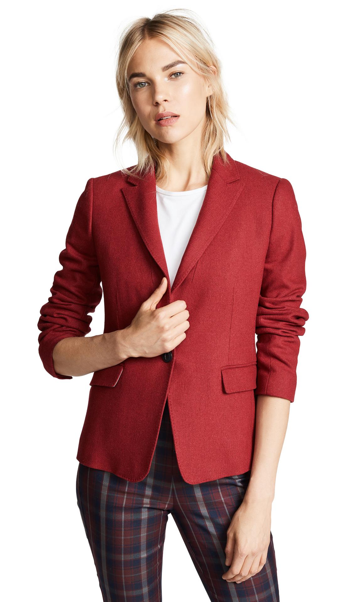
"Adding depth and intensity, Jester Red combines rich elegance with urbanity."—Pantone Color Institute
Turmeric
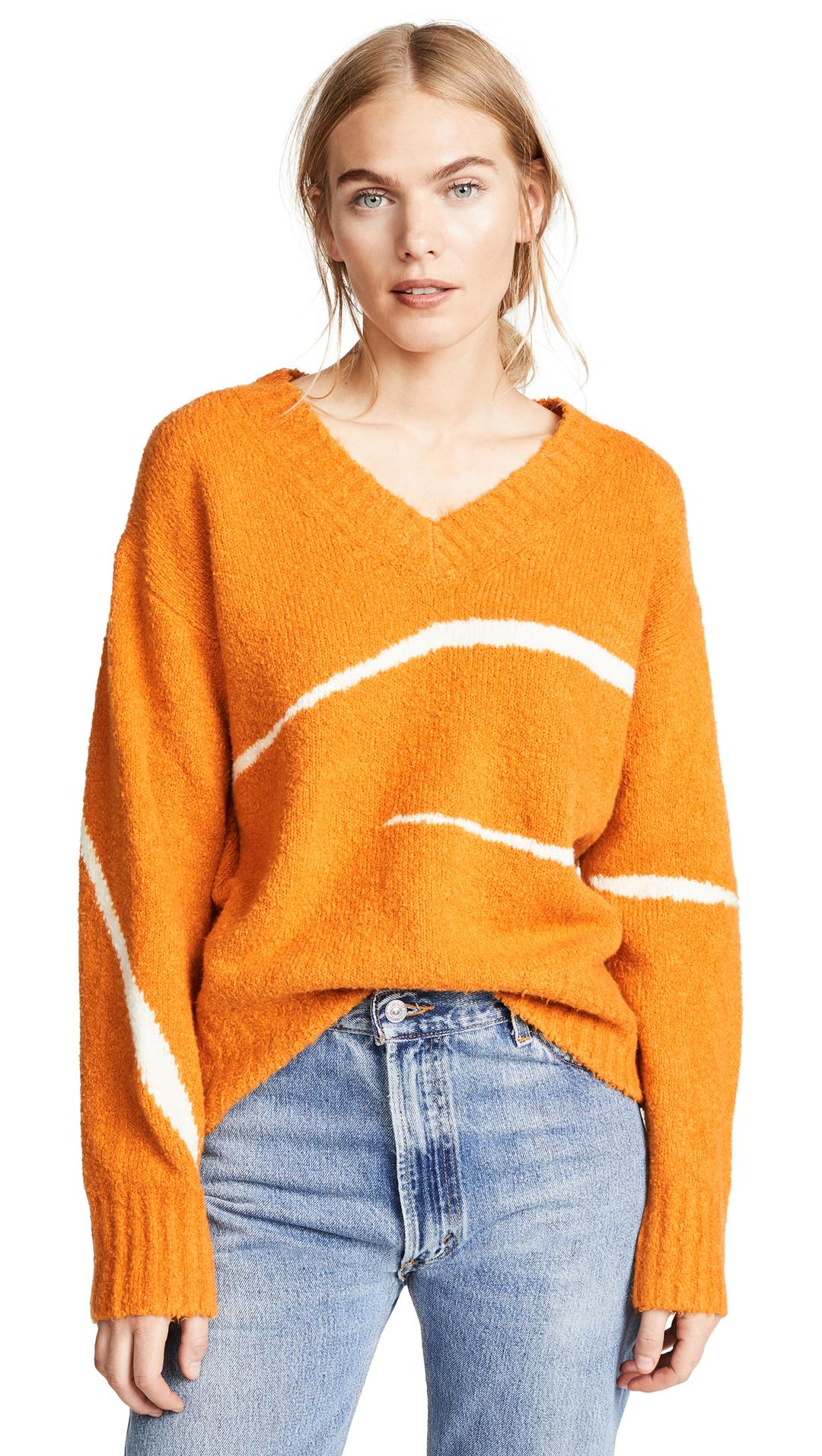
"Turmeric is an enlivening orange that infuses a hint of pungency into the palette."—Pantone Color Institute
Next up: the best colors to wear if you want to look younger.
Allyson is a senior editor forBest Knockoff Luxury Clothing . She joined the company in 2014 as co-founder Katherine Power's executive assistant and over the years has written hundreds of stories forBest Knockoff Luxury Clothing . Prior to her career in fashion, Allyson worked in the entertainment industry at companies such as Sony Pictures Television. Allyson is now based in Raleigh, North Carolina, and is originally from Baton Rouge, Louisiana. She holds a BFA in theater arts. Her path to fashion may not have been linear, but based on the number of fashion magazines she collected as a child and young adult, it was meant to be.