It's Never Been Easier to Mix and Match Prints
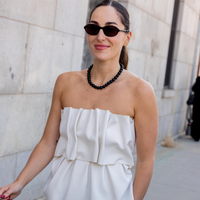
Power clashing just may well be the one trend we're all sleeping on this spring. We already covered how style setters are actually wearing the color clashing trend with spring's freshest pastel palette, and today we're exhibiting how to mix prints to create the ultimate power look. Though the thought of mixing wildly clashing patterns may stress you out, the following outfits will more than prove that pulling off the look is totally doable. Follow these simple rules so you can pull it off seamlessly.
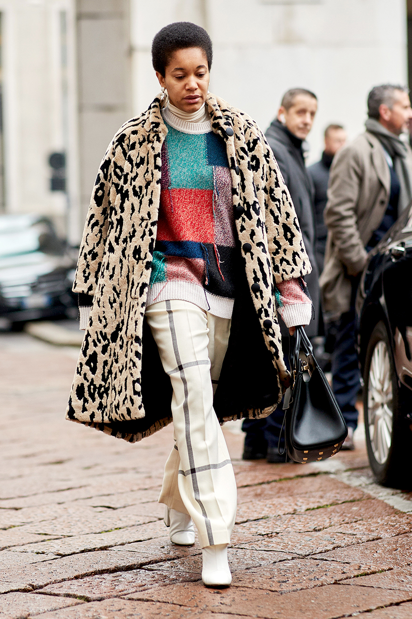
Play with proportion. Pair bolder, more graphic prints together for a combination that's as unlikely as it is stylish.
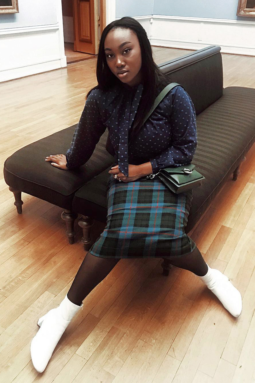
Pro tip: Mixed prints in the same tonal range look more put-together than not. Even though her polka-dot top isn't exactly the same as her skirt, the darker multicolor plaid complements it well.
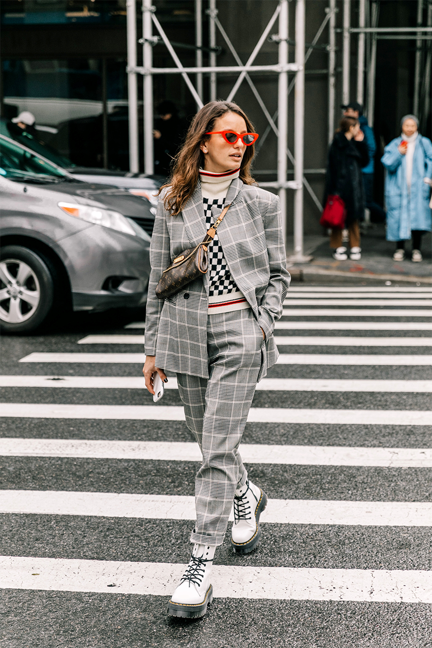
Try out prints that are similar in design yet occupy opposing style camps. A boldly checkered sweater gives this gray checkered suit a cool street style approved feel.
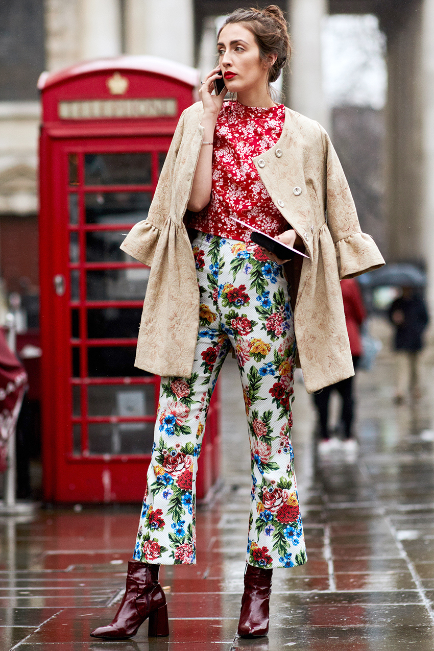
Florals are some of the toughest patterns to mix and match with, as each floral print we come across is so different than the next. One tip that always works for doubling up on the florals is to opt for one monochrome print (her red top here) and one multicolor print that picks up the first color (this would be her printed pants).
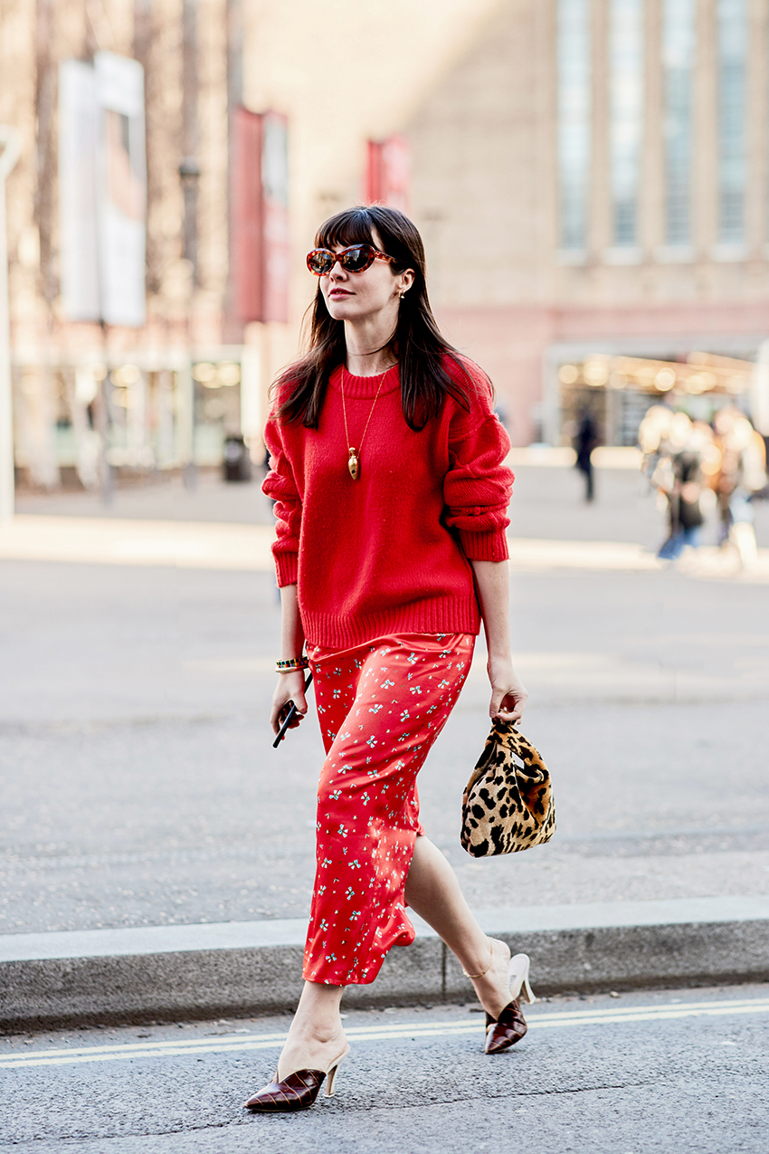
There's less of a science to this combination, but lately, we've been loving leopard print and red together. Her skirt here has a very delicate floral pattern to it, which wears nicely against the louder bag.
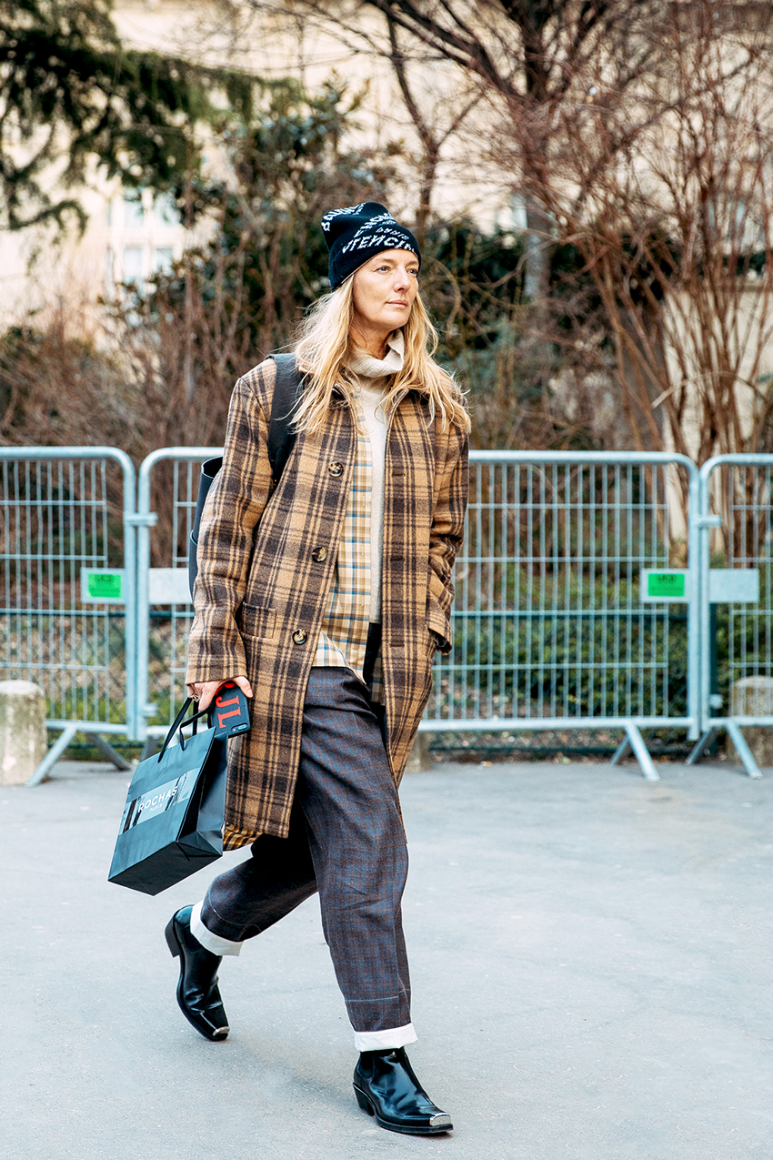
This is another excellent example of mixing two of the same style prints. Checkers imagined in different colorways and sizes create a compelling contrast.
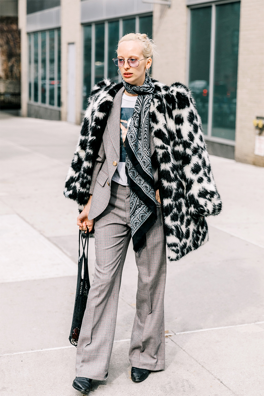
When in doubt, go completely monochrome. This look proves that when you stick to classics like black and white, you take on just about any mixed prints.
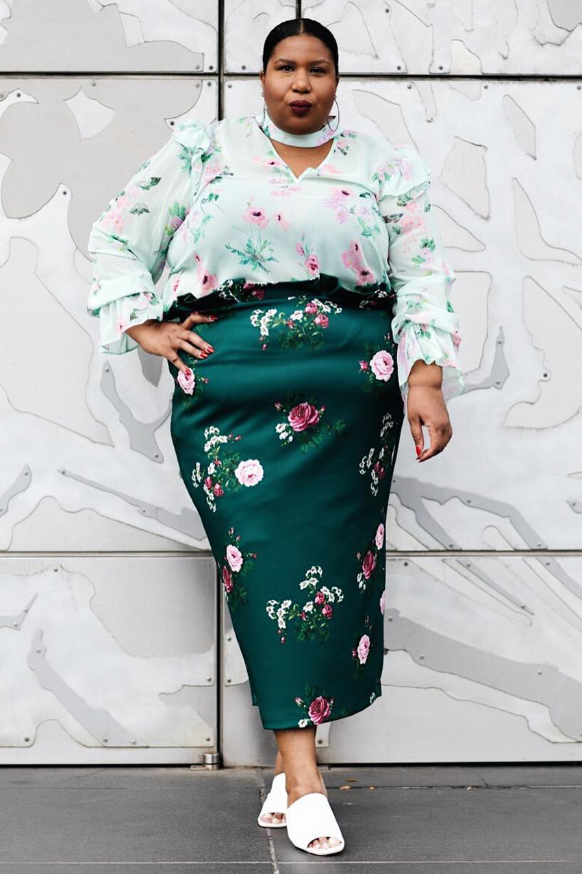
Have we expressed how important attention to color is here? Inverted color schemes are the perfect way to wear matching prints.
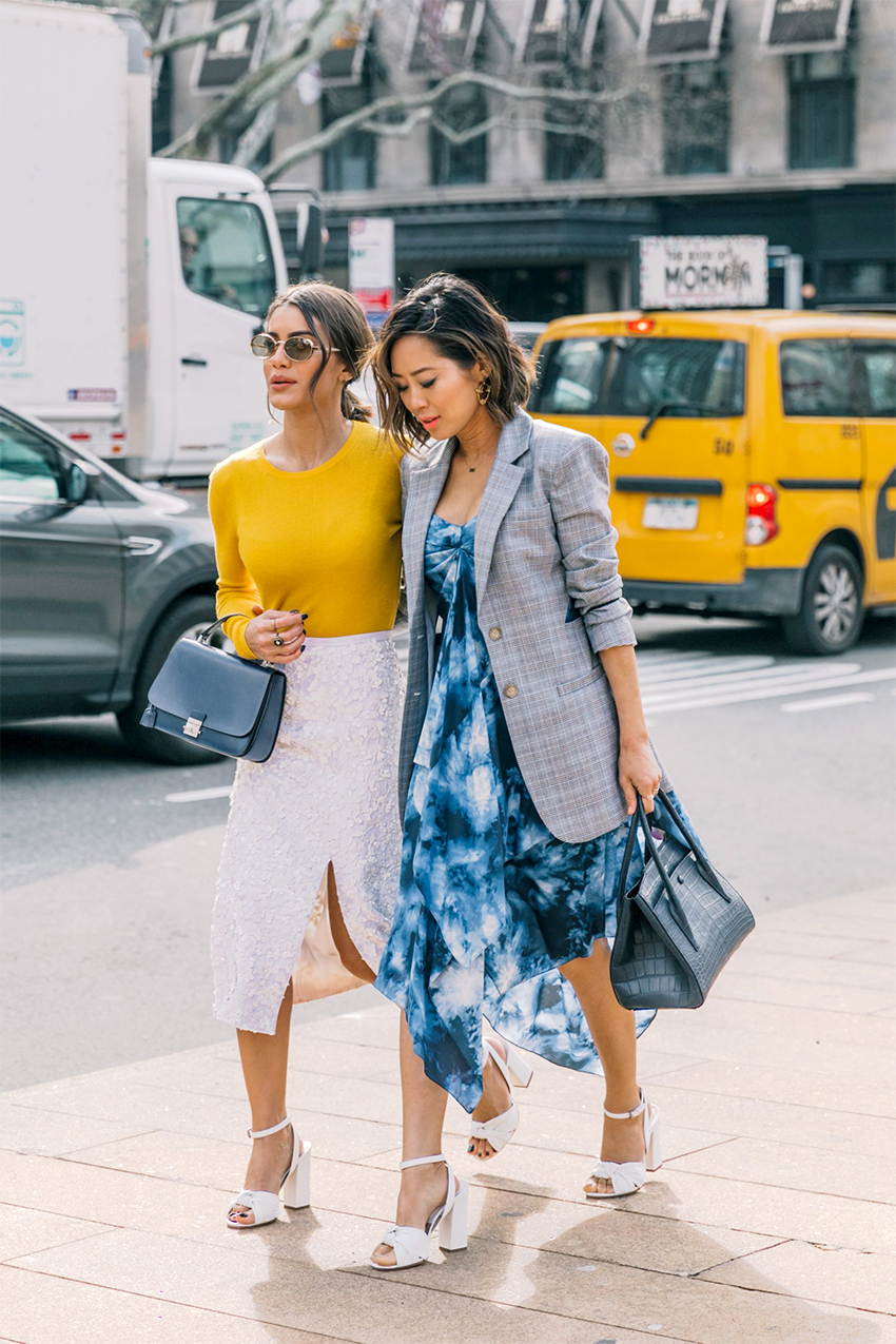
Create a winning look when you combine two totally opposing prints like bohemian-inflected tie dye and business-ready checkers.
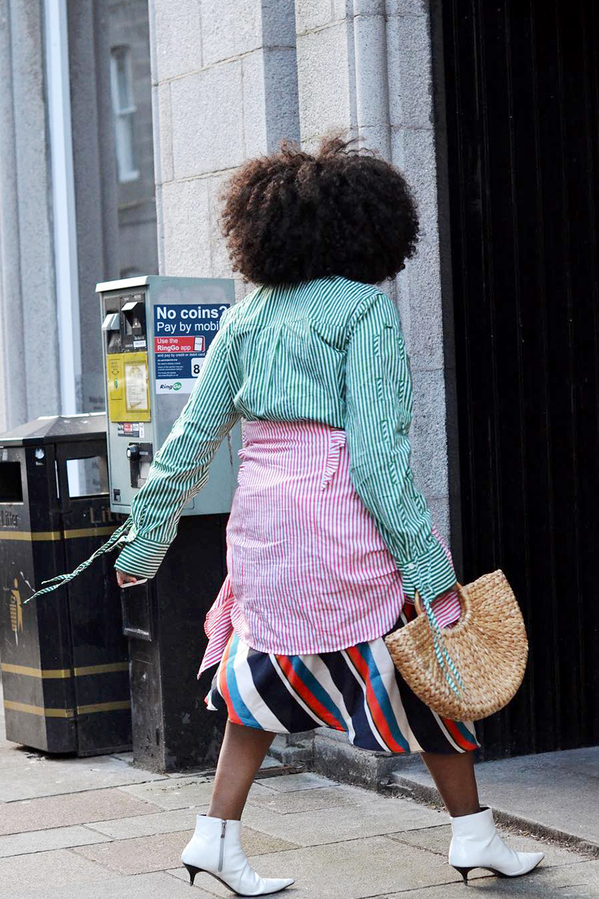
Smaller, fine stripes are met with bolder graphic stripes for a fresh look that screams spring.
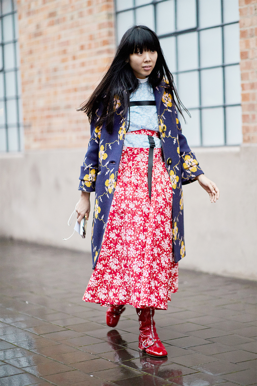
Our number one piece of advice for pulling off the look? Marry delicate patterns with bolder ones.
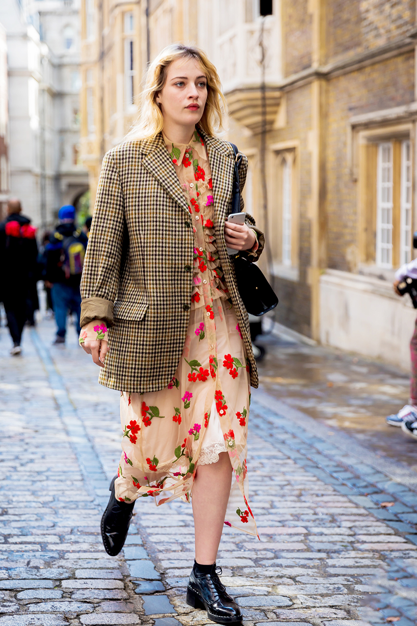
Clashing patterns based on the same color scheme actually go together, against all odds.
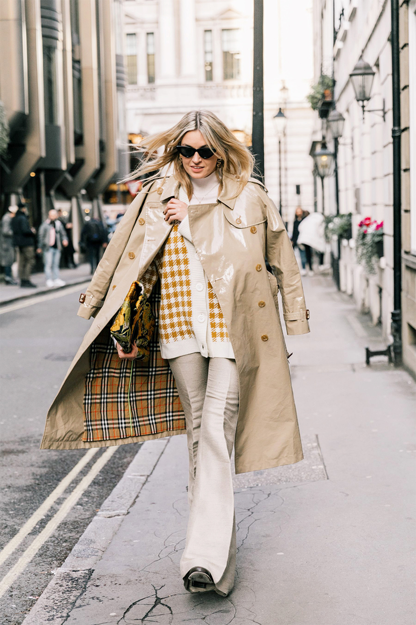
Double up on the gingham when one is smaller and multicolored and the other is larger and plainly colored.
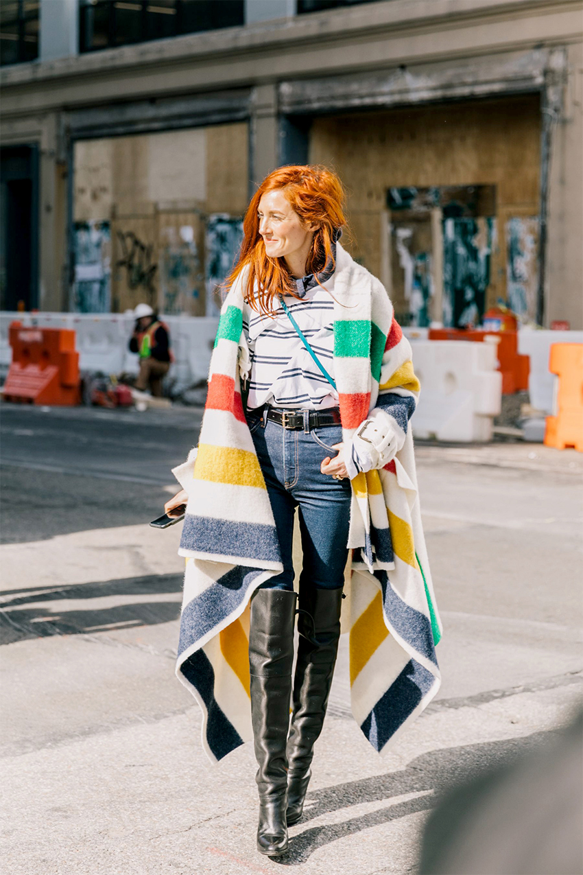
Pair loud and colorful stripes with their thin, minimal counterparts.
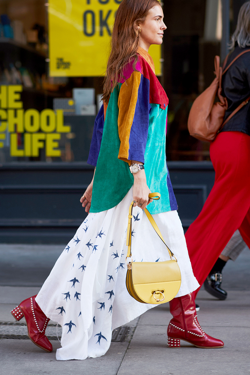
Lastly, start with the bolder of the prints you wish to mix and pick out one color from its pattern. As for the second print, opt for a more delicate design that utilizes just that one shade.

Anna is an NYC-based senior fashion editor who has been a member of theBest Knockoff Luxury Clothing team for over eight years, having begun her career in L.A. at brands like Michael Kors and A.L.C. As an editor, she has earned a reputation for her coverage of breaking trends, emerging brands, luxury shopping curations, fashion features, and more. Anna has penned a numberBest Knockoff Luxury Clothing cover interviews, including Megan Fox, Julia Garner, and Lilly Collins. She also leads the site’s emerging travel vertical that highlights all things travel and lifestyle through a fashion-person lens.