I'm a Stylist and Fashion Expert—This is the Simple Trick I'd Recommend If You Want to Look Classy
Ebony Francis knows her stuff. Previously creative director at Free People, she has built a career on knowing what looks good and what doesn't. Her experience and exquisite taste have earned her thousands of followers—and fans—on Instagram, and she even started a weekly podcast talking all things fashion with fellow content creator Emma Thatcher. Alongside this, Ebony is a stylist and host, sharing her tips and tricks on how to create an elegant yet wearable capsule wardrobe. In her second column, she shows us how to style five tonal winter outfits featuring trending yet timeless shades. Scroll on to see her looks and shop her picks to re-create them at home.
My everyday wardrobe often leans towards tailored separates and relaxed elegance, but lately, I’ve developed a deep love for monochrome dressing, finding strength in the subtle beauty of a single shade. So for my second column, I wanted to highlight five colours that have shaped my style journey, from the timeless appeal of mushroom and greige to the bold drama of scarlet and poppy.
Below, you'll find my personal styling notes, tips for nailing head-to-toe-colour looks and where to shop for key pieces in each palette. Whether it’s a favourite tone, a new colour I’m trying or a shade I never thought I’d wear, I’ll walk you through how to create bold, wearable monochrome moments. With insights on texture, seasonality and mindful purchasing, I hope to inspire confident colour choices that reflect your unique style.
5 TONAL OUTFITS I'M WEARING THIS WINTER AND WELL INTO 2025
1. The Calm Hues: Greige, Putty, Mole and Mushroom
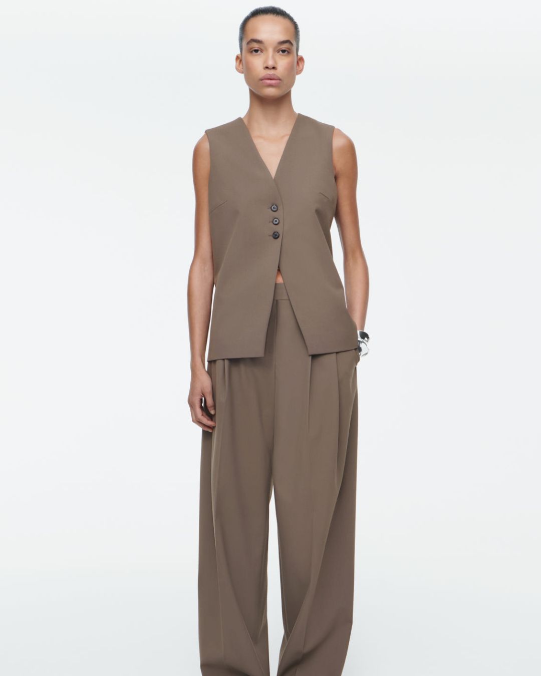
Style Notes: The beauty of tones like greige, putty, mole and mushroom lies in their muted elegance. Greige serves as the perfect neutral, seamlessly blending warm and cool tones, whilst putty introduces a subtle warmth with its delicate beige undertones. Mushroom presents a soft, muted green with a gentle grey base that evokes a sense of tranquillity. Meanwhile, mole adds a rich, slightly deeper greyish-brown hue, creating a stunning base for layering and texture play. Together, these shades exude understated sophistication, offering versatility that works across seasons. This refined palette is ideal for crafting polished, minimalist looks that resonate a quiet confidence.
I’ve always gravitated towards these shades for their calming yet elevated feel that allows me to feel polished without being too bold or overstated. Whether I’m attending a meeting or styling an off-duty look for a day of appointments, these tones allow me to experiment with texture and silhouette whilst maintaining a sophisticated aesthetic. For me, this palette feels like a blank canvas on which I can layer or allow the fabric of my pieces to do the talking. Besides black, these are my favourite shades to wear.
Styling Tip: Focus on Shape and Silhouette
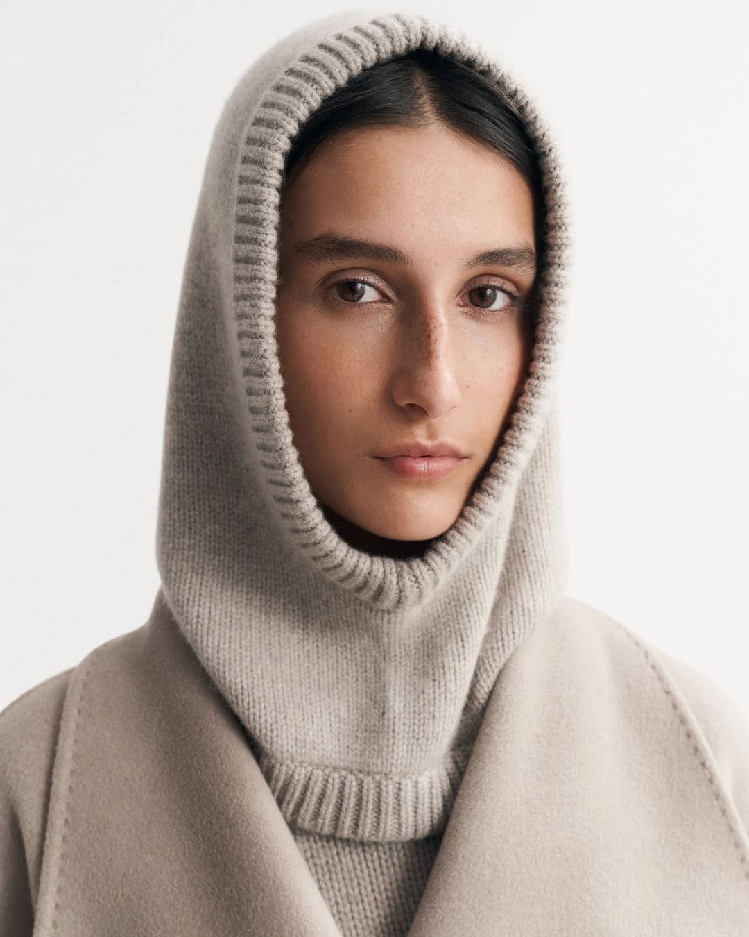
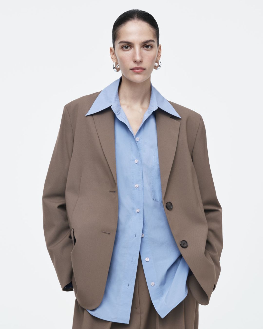
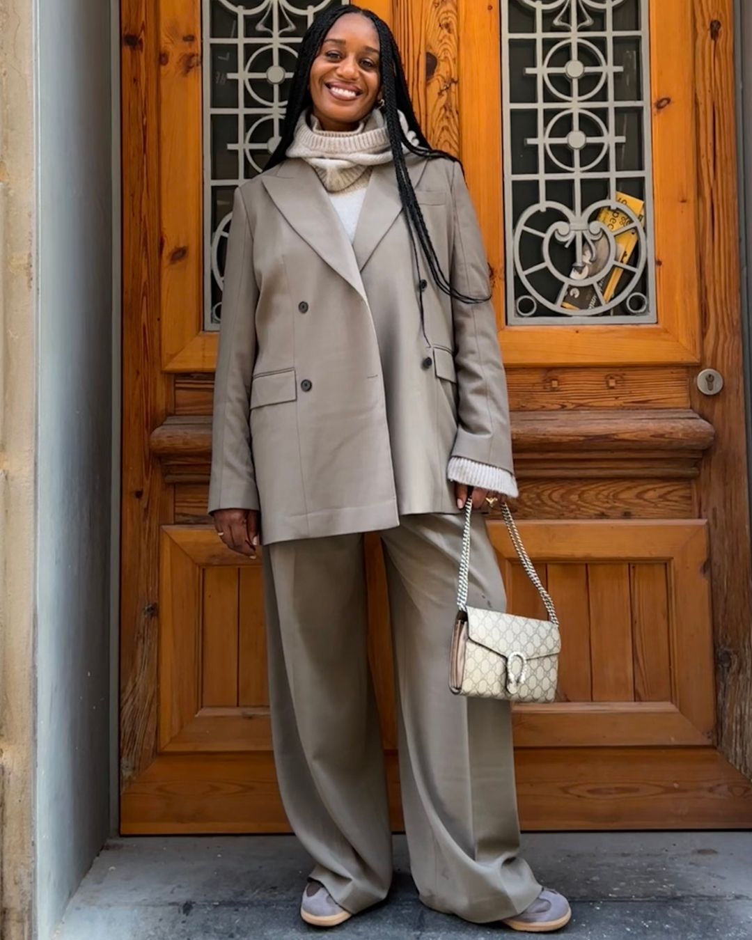
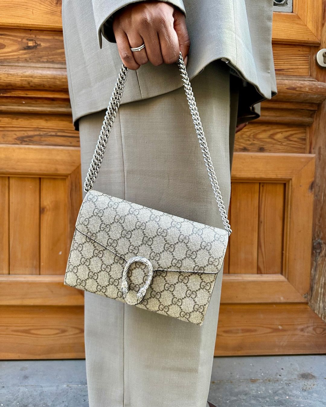
I started my outfit with an oversized cashmere turtleneck and matching balaclava from Soft Goat—the brand offers most of its knitwear in the most perfect greige. I layered this knitwear under a Jigsaw double-breasted suit from last year which I have worn on repeat. It's currently out of stock, but COS's tailoring is just as good this year.
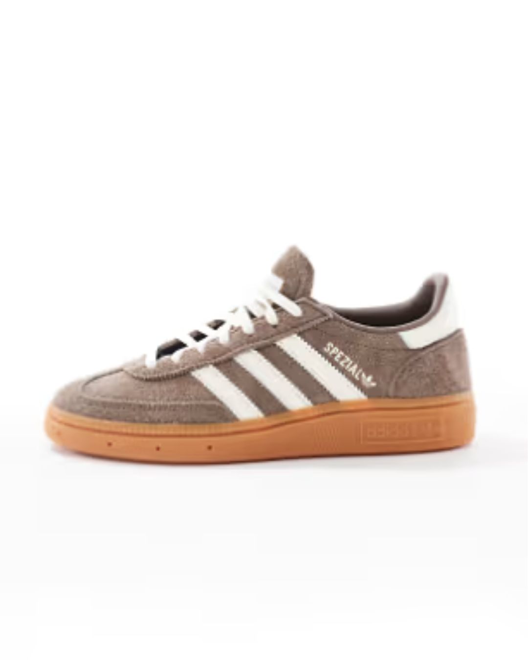
To break up the outfit, I finished the look with a pair of Adidas Sambas in the new putty-grey colourway and a Gucci bag that I have had for 10 years. These accessories add contrast to the soft textures without disrupting the overall harmony. The balance of tailored and relaxed pieces in complementary textures of cashmere, wool and leather creates a dynamic silhouette and an air of ease.
When creating a head-to-toe look in this palette, the key is to play with shape and silhouette. From soft knitwear to structured tailoring paired with sporty footwear, neutral shades like mushroom, greige, putty and mole are perfect for creating a clean, minimal look that still feels rich in depth and dimension. The beauty of these shades is that they don’t demand attention but they never go unnoticed.
Shop Calm Hues:
2. The Warm Hues: Ginger, Chestnut, Tobacco and Conker
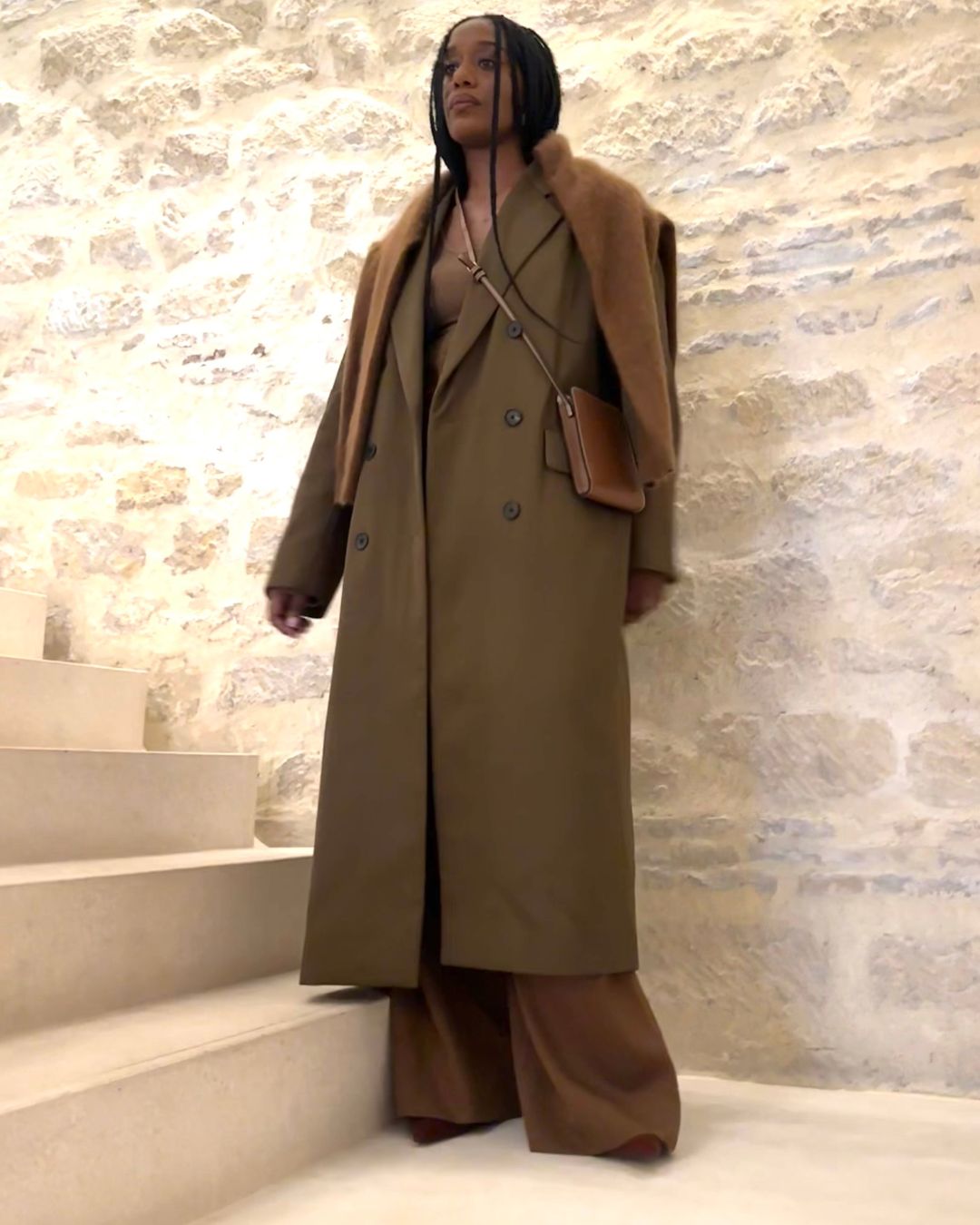
Style Notes: The ginger, tobacco, conker and chestnut colour family is a rich palette of warm, earthy tones that evoke autumn—my favourite season for outfit styling and shopping. Whilst I love the deeper cocoa shades we've been seeing recently, I've been drawn to wearing a warmer family of tones. Ginger is a vibrant, spicy reddish-brown, whilst tobacco adds a deep, smokey sophistication and both conker and chestnut bring rich, chocolatey warmth. Together, these shades are rich and effortlessly refined.
There’s something so grounding and comforting about these tones; I’ve always loved how they add a sense of richness to an outfit and remind me of crisp autumn days, the scent of leather and changing leaves. Drawing inspiration from nature at this time of year, I gravitated towards Jigsaw's autumn/winter 2024 collection which has a cohesive warm colour palette across outerwear, knitwear and accessories.
Styling Tip: Play with different textures
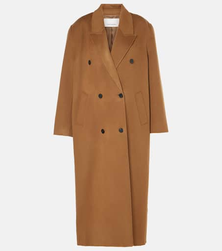
This sleek double-breasted twill coat sparked joy as soon as I saw it, and whilst I have similar coats in my wardrobe, I was immediately drawn to the colour. Adding the 100%-cashmere cardigan in Ginger was a no-brainer as the texture of the yarn is a beautiful addition to the outfit.
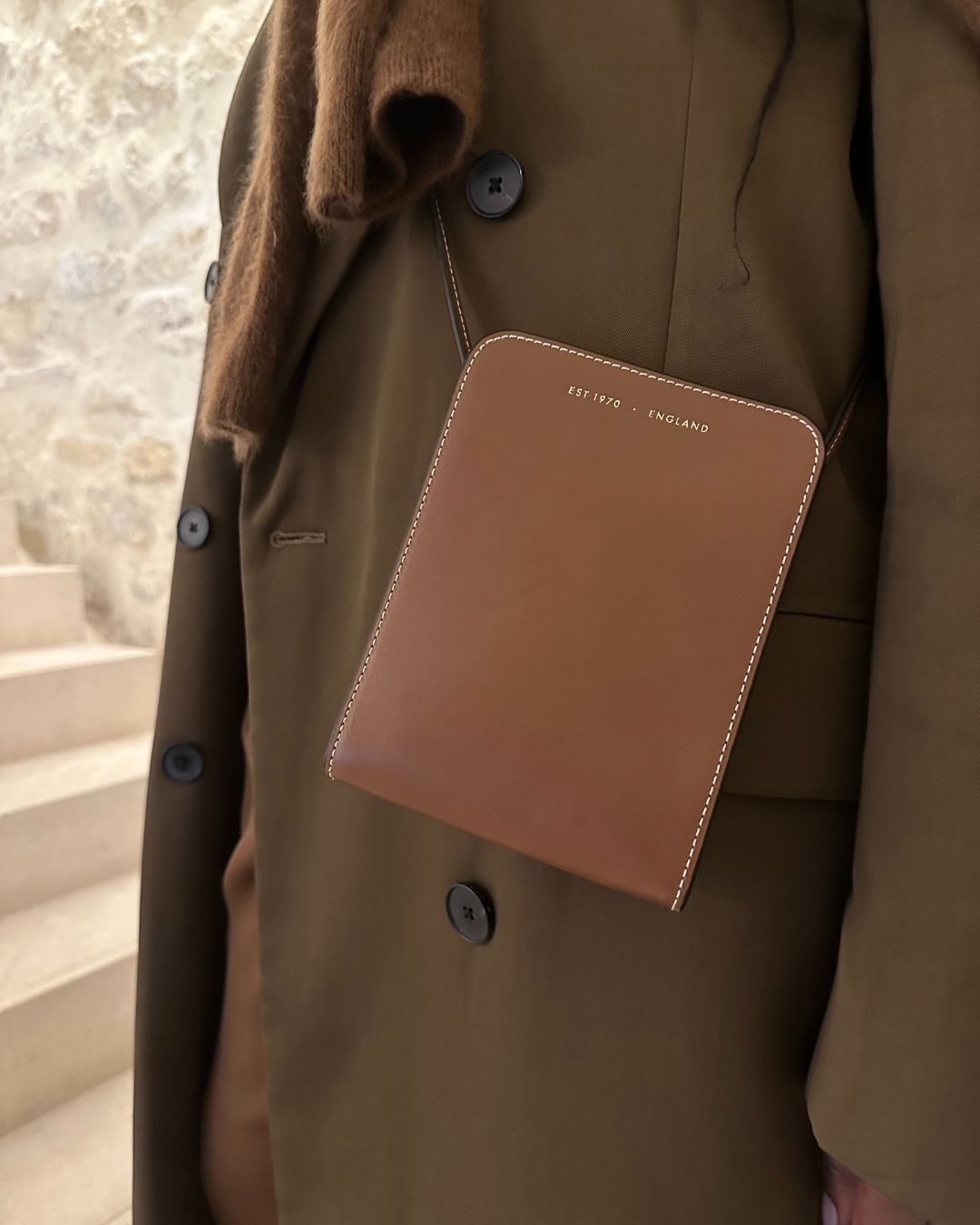
This overcoat with floor-skimming trousers is my go-to outfit combination right now. I chose these Wardrobe.NYC tailored trousers in the same hue and paired them with a simple white tee to break up the rich palette and add a modern proportion to the look. I finished it off with textured accessories: a sleek leather crossbody bag and velvet slingback heels.
When styling these shades, lean into their warmth by combining different textures that enhance their richness. This palette works particularly well with natural materials like leather, suede, wool and corduroy. Mix soft and hard textures (like silk with wool or leather with cotton) to add depth. Add matching leather boots or a scarf in softer shades of rust or caramel to balance the vibrancy whilst keeping the look tonal.
Shop Warm Hues:
3. The Dramatic Hues: Plum, Aubergine, Merlot and Port
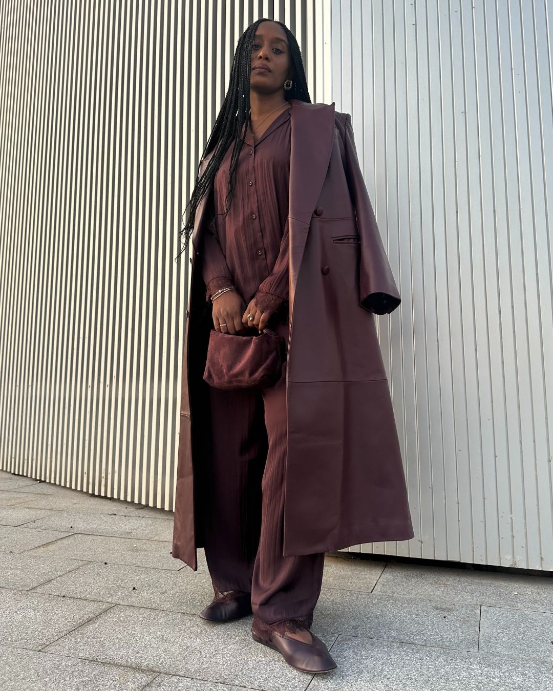
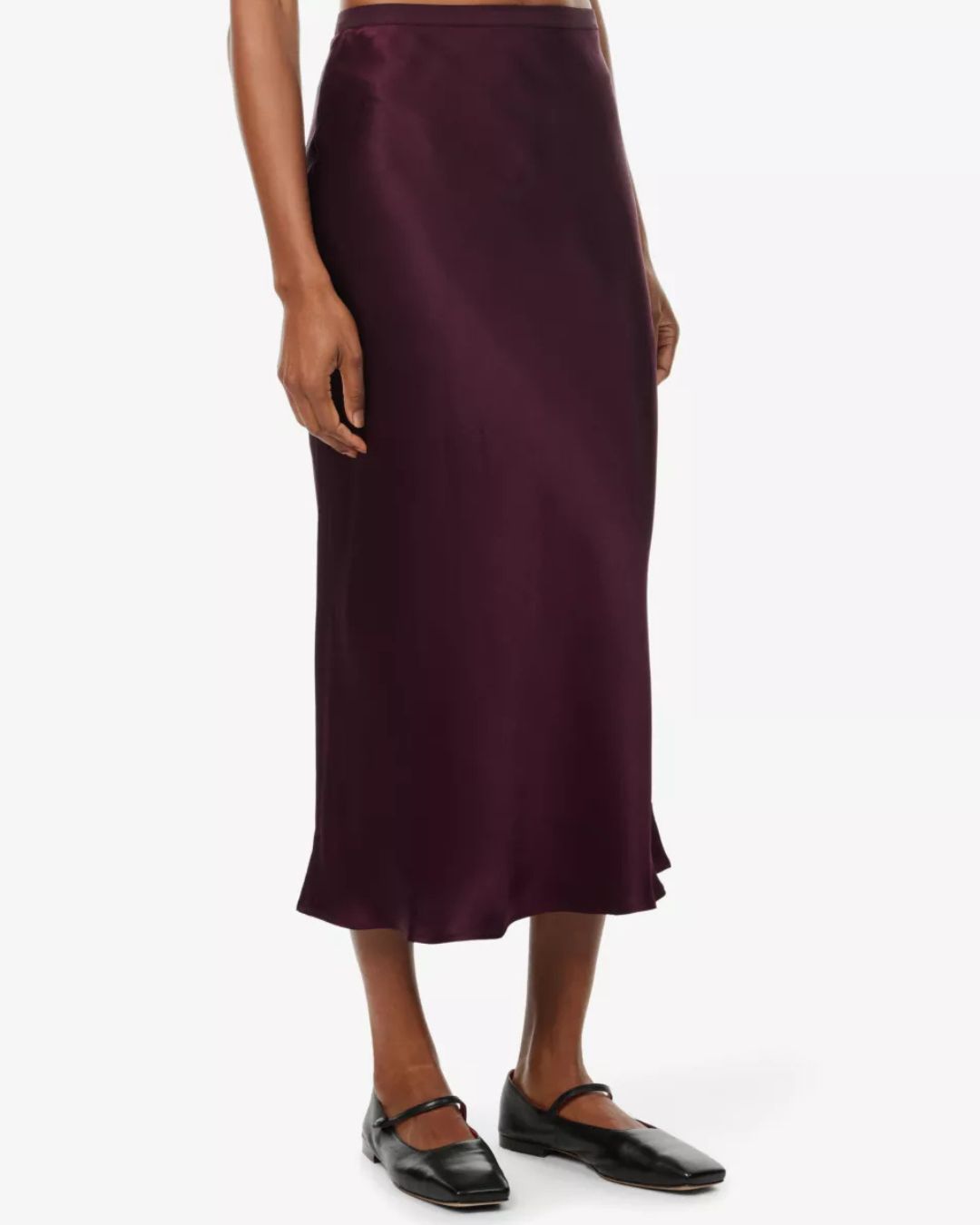
Style Notes: The plum, merlot, port and aubergine colour family embodies depth, richness and bold sophistication. Plum feels luxurious and velvety whilst aubergine adds an intense, dramatic undertone with its dark, moody essence. Merlot is a deep hue that radiates warmth and refinement, and port leans into a more grounded feel. Together, these shades offer a palette that feels both opulent and versatile, perfect for creating outfits with impact that are also effortlessly stylish.
I’ve always been drawn to these shades because of their inherent drama and elegance, and I love how they add an instant depth to any look whilst feeling wearable for day or night. There’s something undeniably chic about a well-cut aubergine blazer or a merlot silk dress that can make you feel confident and empowered.
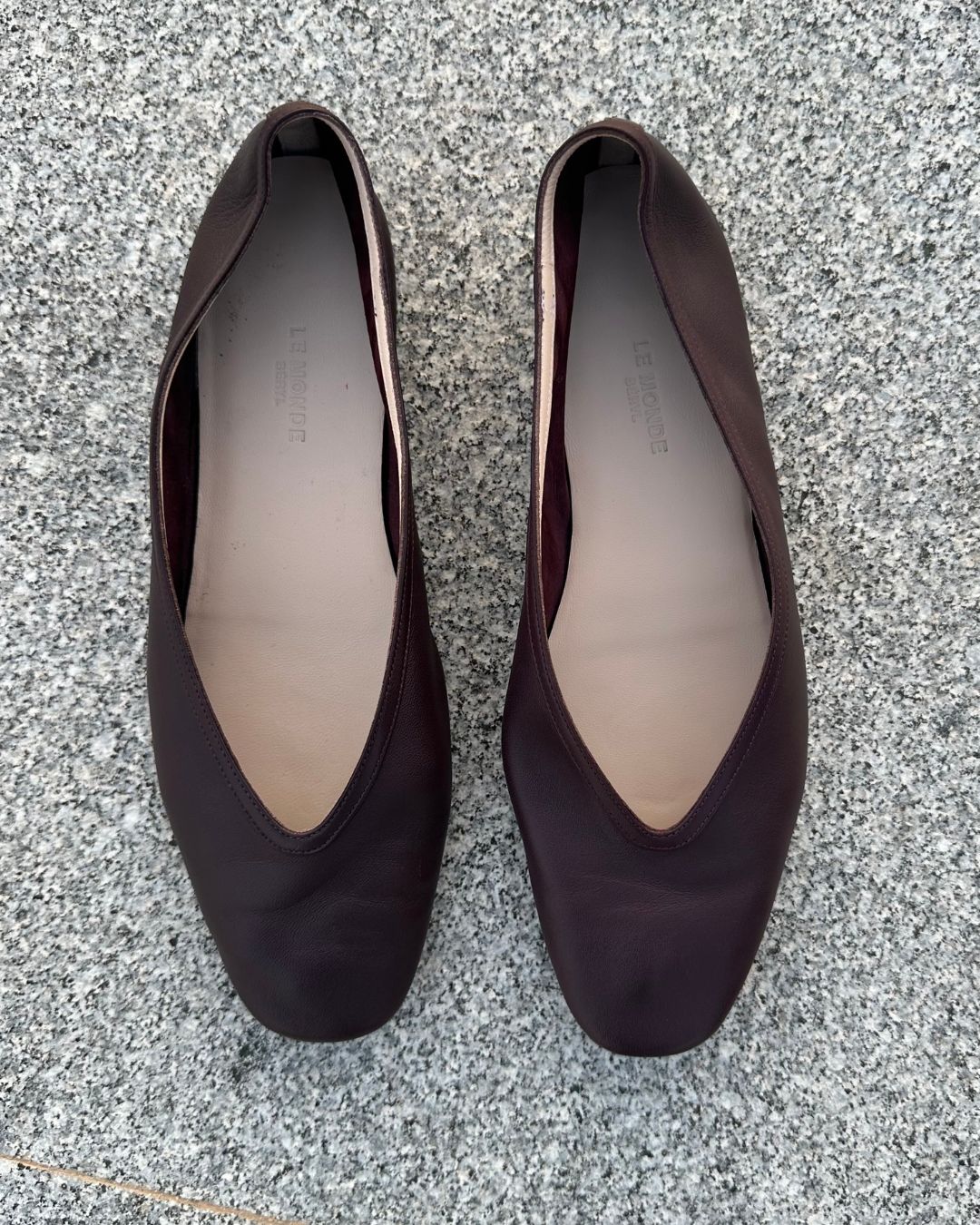
Styling Tip: Make it Evening and Luxe
I have vivid memories of my Grandma Louise painting her nails in the deepest shade of plum just before we would go out for dinner, and I remember thinking she looked so chic. My appreciation for these rich, dark hues has always evoked elegance and sophistication.
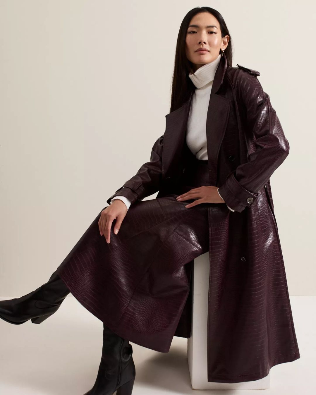
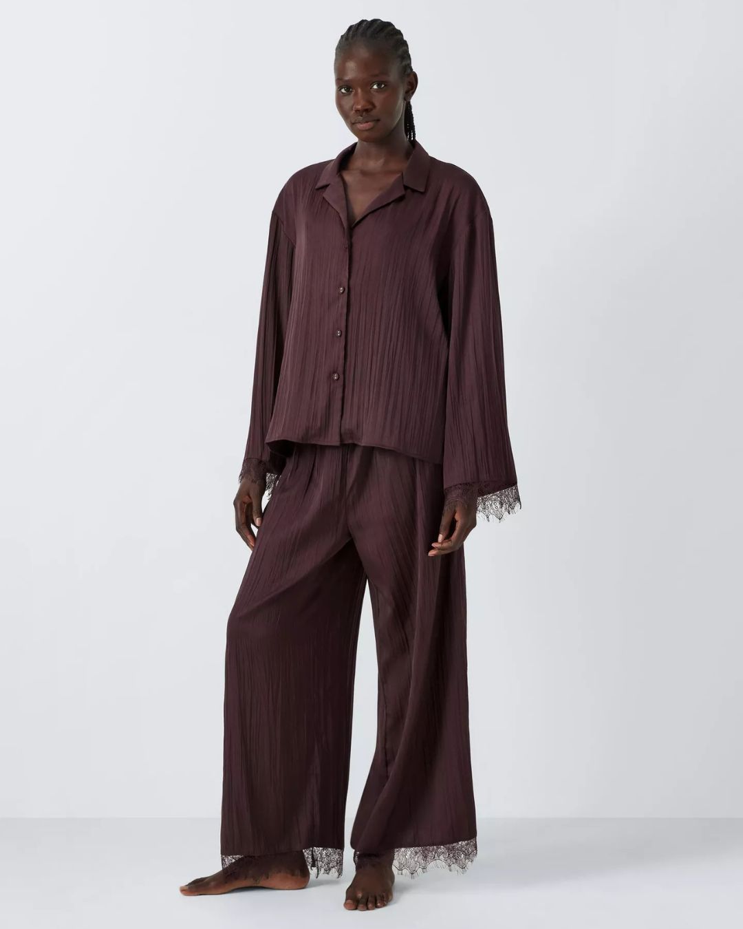
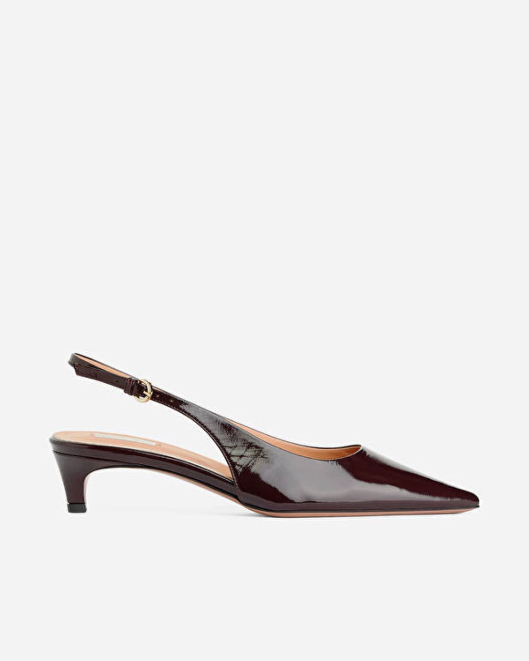
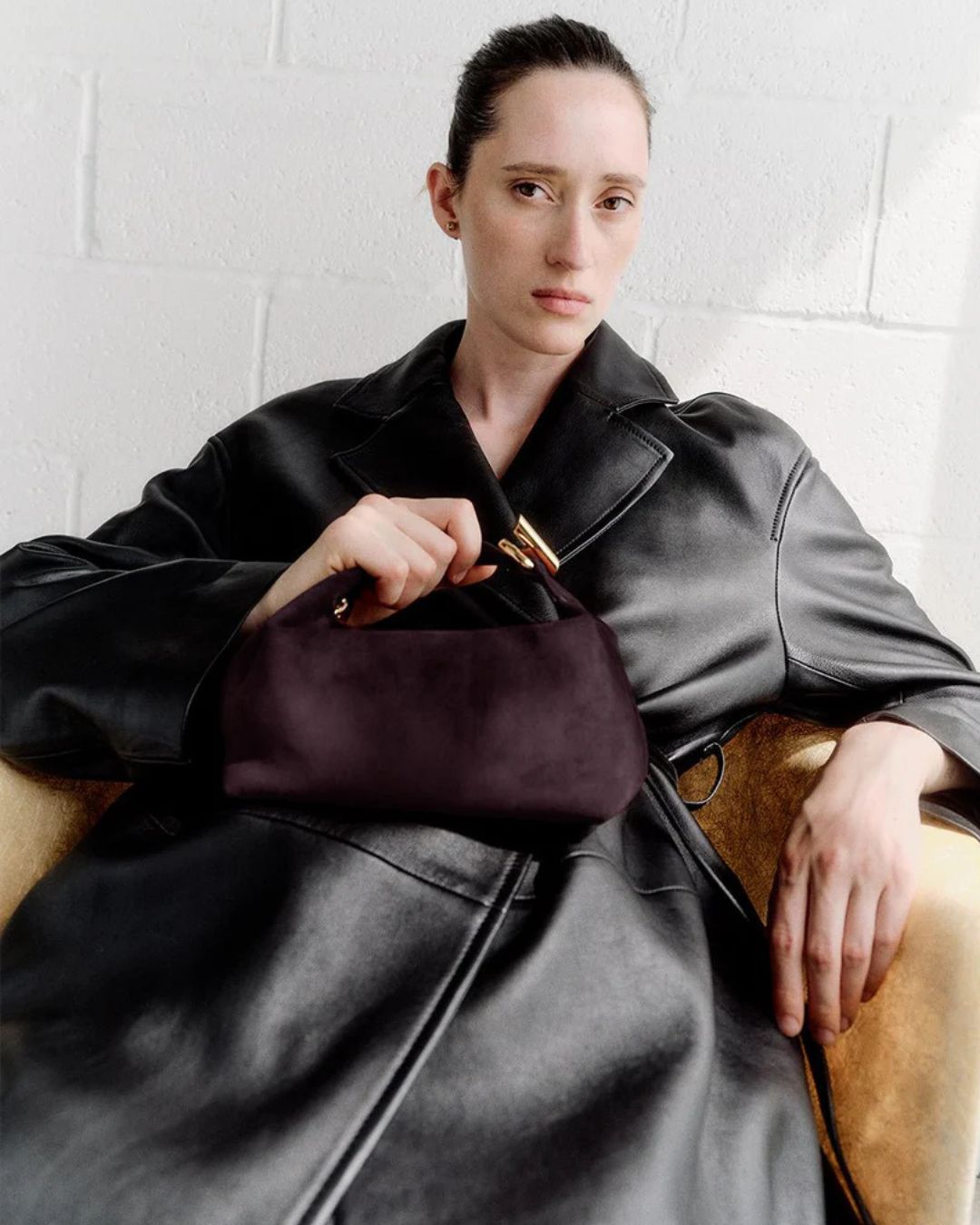
Layering a lace satin pyjama set from John Lewis under De Savary’s burgundy leather trench feels chic yet understated and is an evening outfit that I would wear out for date night. Accessories in complementary tones balance out the richness of the palette, blending seamlessly into the moody hue. I prefer flat shoes and a mini bag for evening looks, so these Le Monde Beryl leather slippers and the new dark-purple micro pouch from Little Liffner are the perfect additions.
When styling these rich tones for the evening, choose beautiful luxe materials like velvet, silk, satin and leather. Shades of merlot, port and aubergine bring instant depth and sophistication to monochrome looks, creating striking, high-impact outfits that feel luxurious and powerful.
Shop Dramatic Hues:
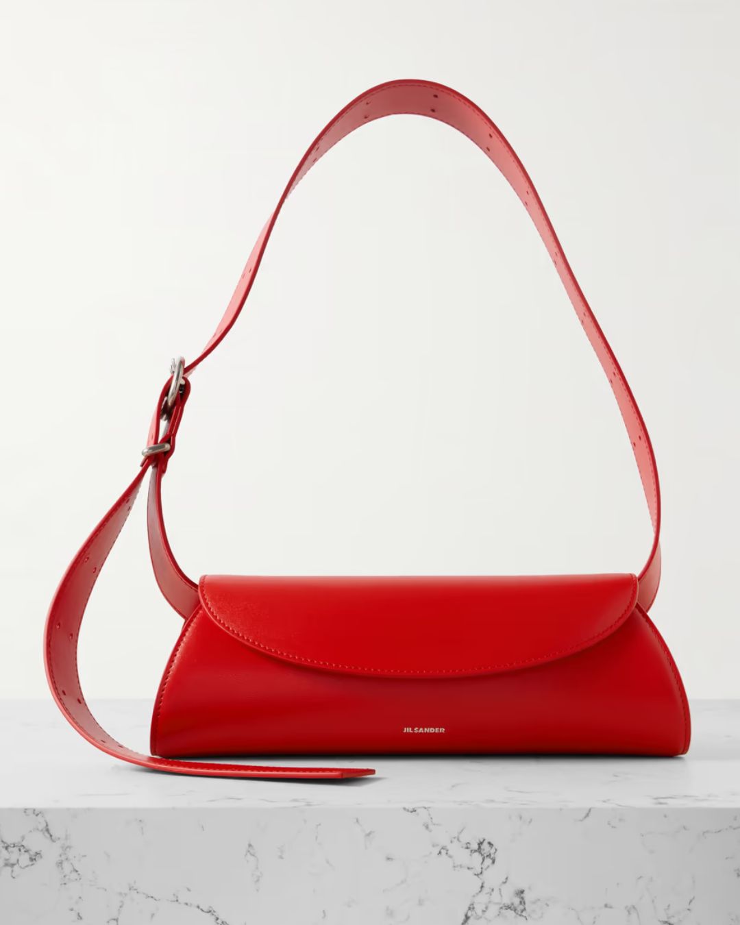
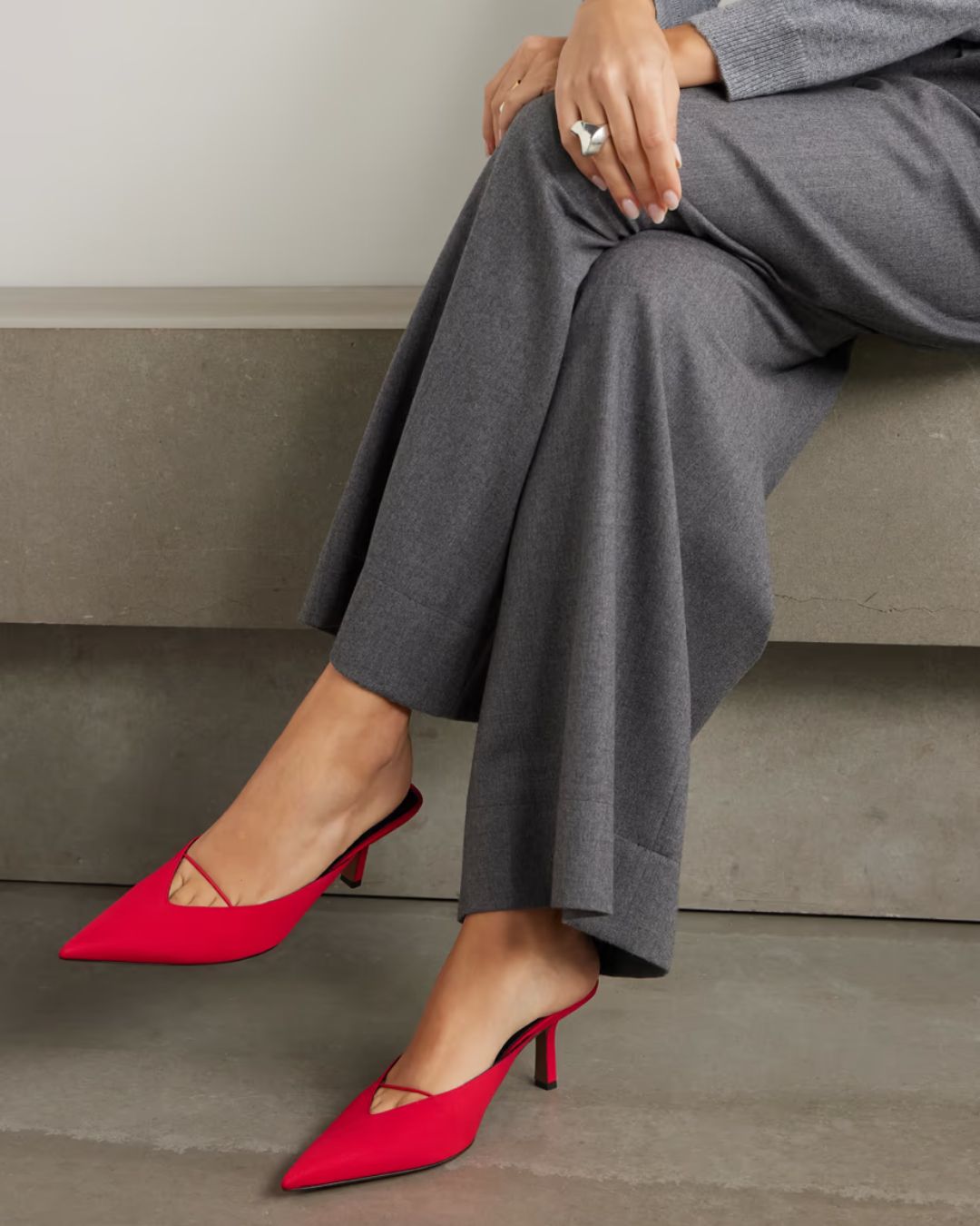
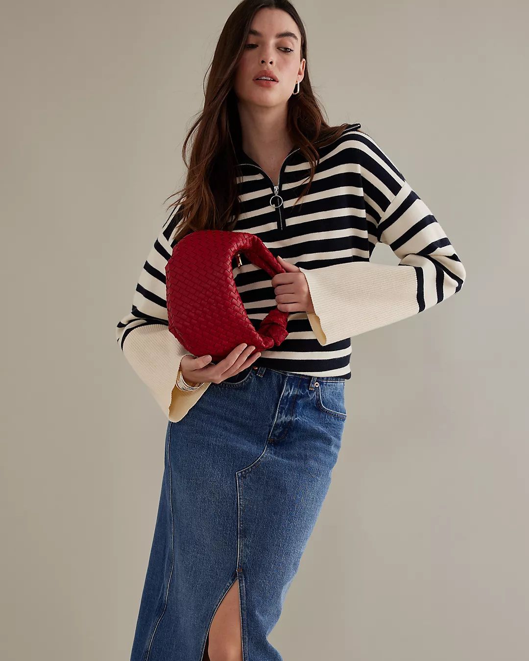
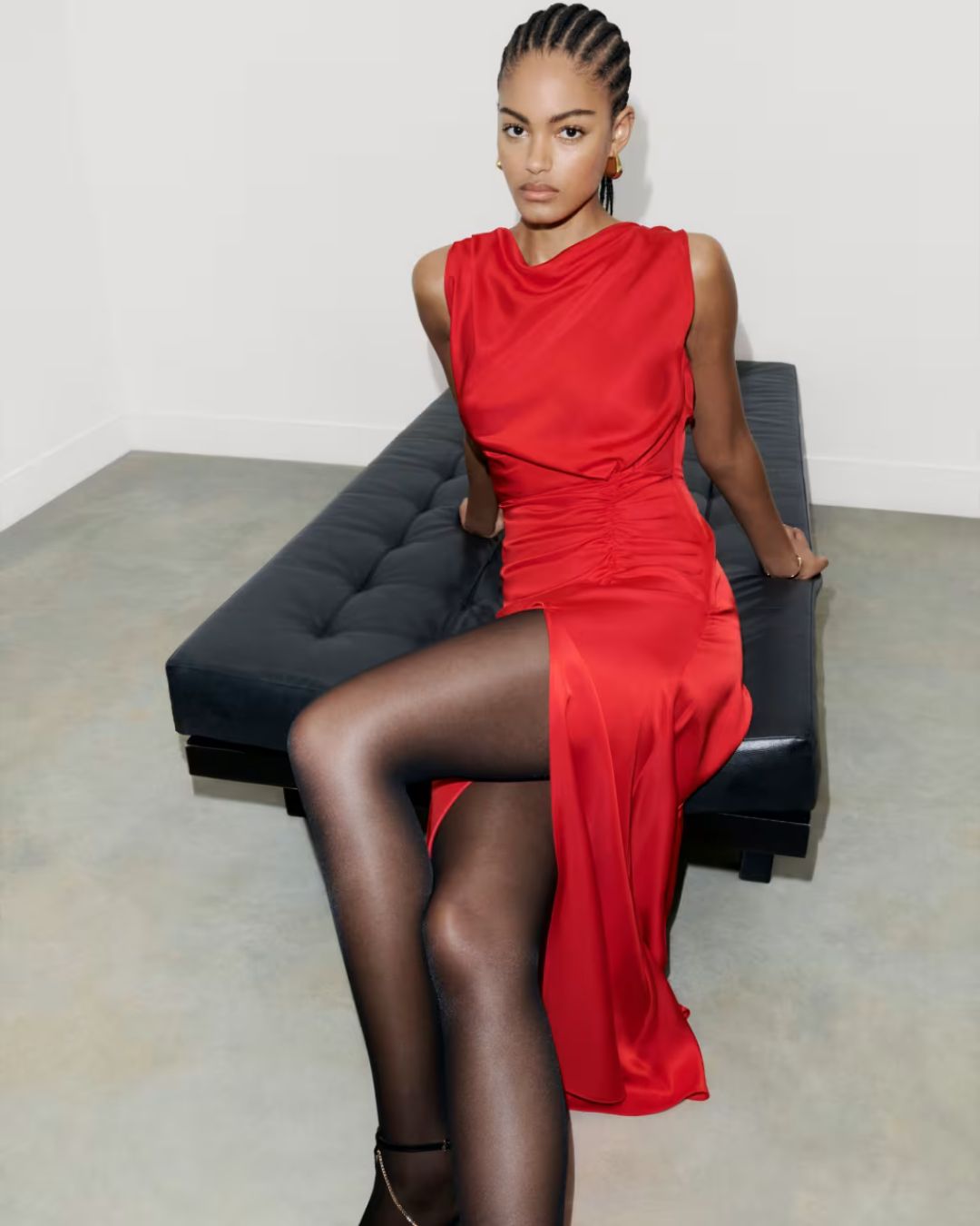
4. The Attention-Grabbing Hues: Ruby, Scarlet, Tulip and Poppy
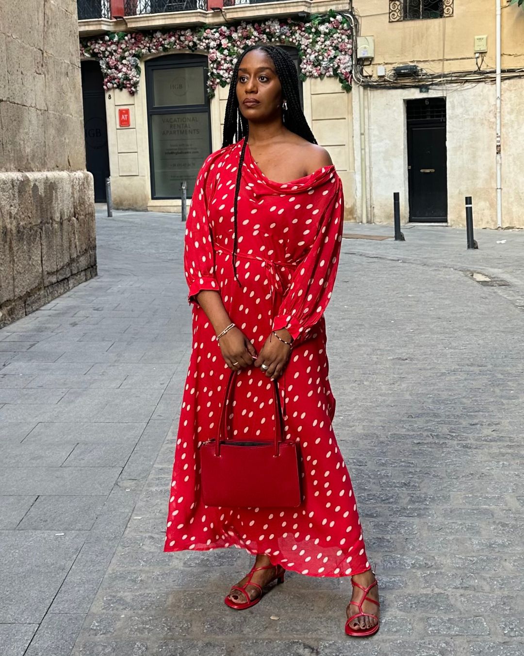
Style Notes: These variations of red radiate intensity, vibrancy and energy. Ruby delivers a rich, luxurious feel whilst scarlet, with its fiery orange undertones, adds warmth to any look. Tulip offers bold elegance with its vibrant and striking tone and poppy’s electric, punchy hue infuses playful energy. Universally flattering and undeniably eye-catching, these shades create a confident statement in any outfit and are surprisingly versatile across the seasons.
For years, I shied away from these vibrant tones, but I'm now venturing into the bold territory of introducing red—a striking departure from my usual, more subdued palette. I recently found a vintage red bag at a local secondhand shop. It's shape is reminiscent of a designer piece, and at just £20, it ignited my enthusiasm to introduce this vibrant colour into my wardrobe.
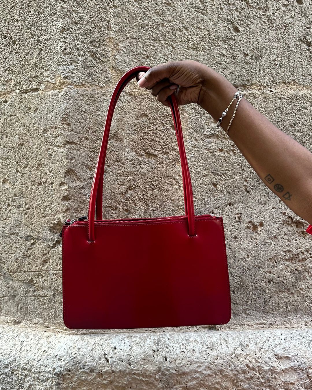
Styling Tip: Add monochrome accessories
Embracing these crimson and poppy tones through my vintage pre-loved find influenced me to purchase a pair of strappy low heels from Massimo Dutti as an inexpensive way to inject colour into a simple outfit I already felt confident in. I first wore these pieces to the Who What Wear Summer House event this summer, where I paired my patent-leather red bag and heels with a tan barn jacket, a white tee and black, tailored trousers. I loved how bright and energetic I felt in my outfit.
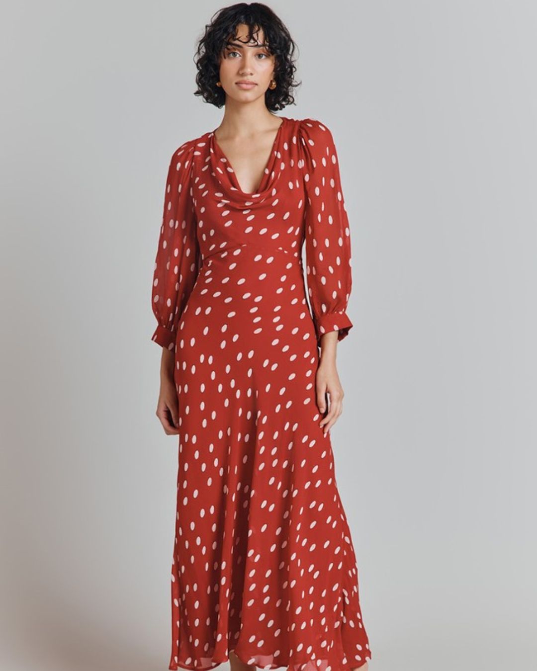
Diving into this brighter colour family, I was so pleased to see that one of my favourite dresses from Ghost was also available in red. Knowing how amazing I felt in the black version gave me the confidence to embrace this bold hue. I opted for the same strappy sandals to keep the look casual. The touch of white in the print keeps the look balanced.
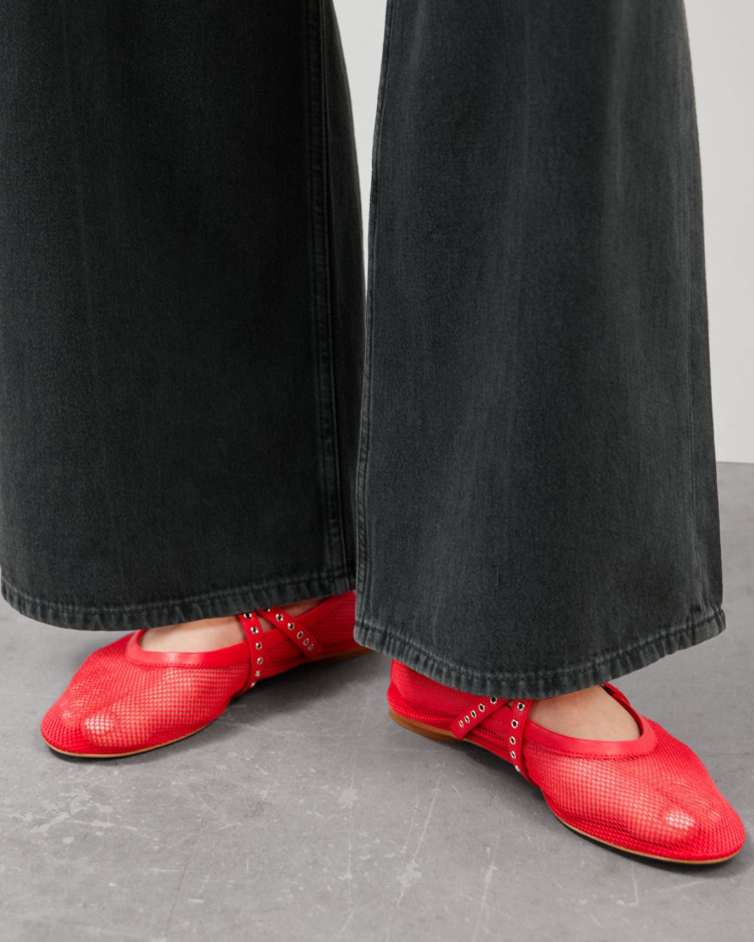
Fully embrace the impact of an all-red look with matching accessories by pairing a poppy-red dress with statement red flats and a structured ruby bag. To create a cohesive, impactful look, the key is to keep accessories within the same red family whilst opting for sleek, minimal styles that allow the colour to pop. This monochromatic approach ensures that your outfit feels intentional and refined.
Shop Attention-Grabbing Hues:
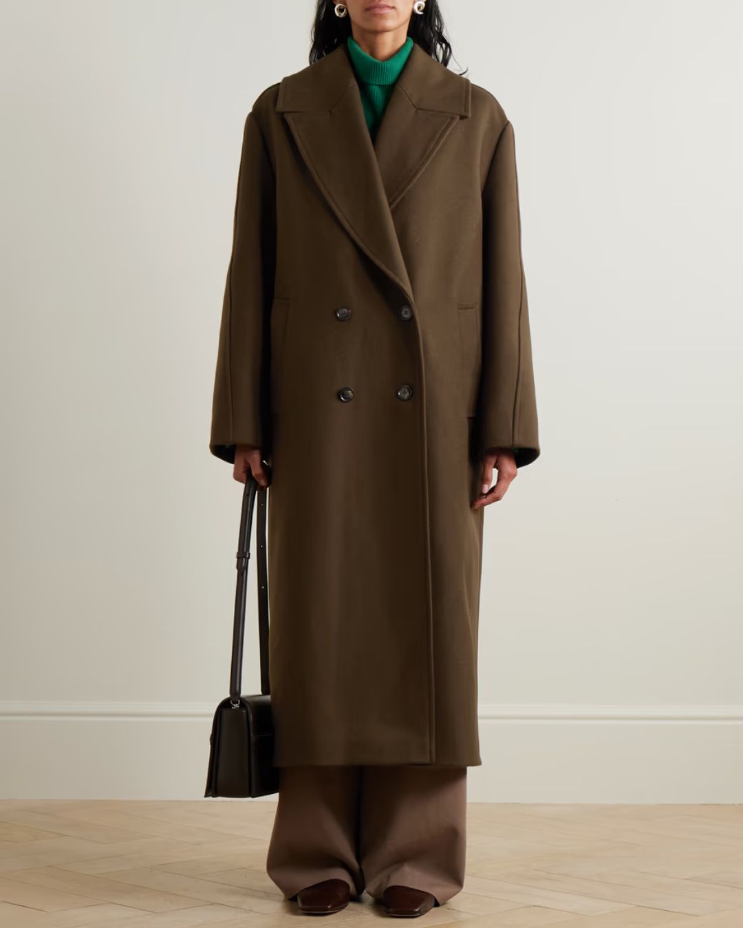
5. The Adventure-Ready Hues: Olive, Moss, Pine and Khaki

Style Notes: The moss, pine, khaki and olive colour family offers a serene palette of earthy greens that embodies calm and balance. Olive grounds the spectrum with its depth whilst moss presents a soft, muted green with subtle grey undertones. Pine boasts a deep hue reminiscent of evergreen forests and khaki introduces a lighter, neutral tone with hints of brown. Together, these shades exude understated polish infused with a touch of cool sophistication, making them ideal for the modern, minimalist wardrobe, especially at this time of year.
I've felt increasingly inspired to incorporate earthy tones into my wardrobe this year. Though my home has always been filled with plants and various shades of green, I've yet to embrace this palette in my personal style. It was fun to loan a few pieces for this last look to see how the colours complement my skin tone, and I’m considering investing in this quality suede trench to boost my outerwear collection.
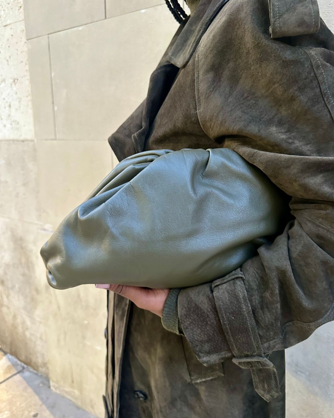
Styling Tip: Invest in a statement coat
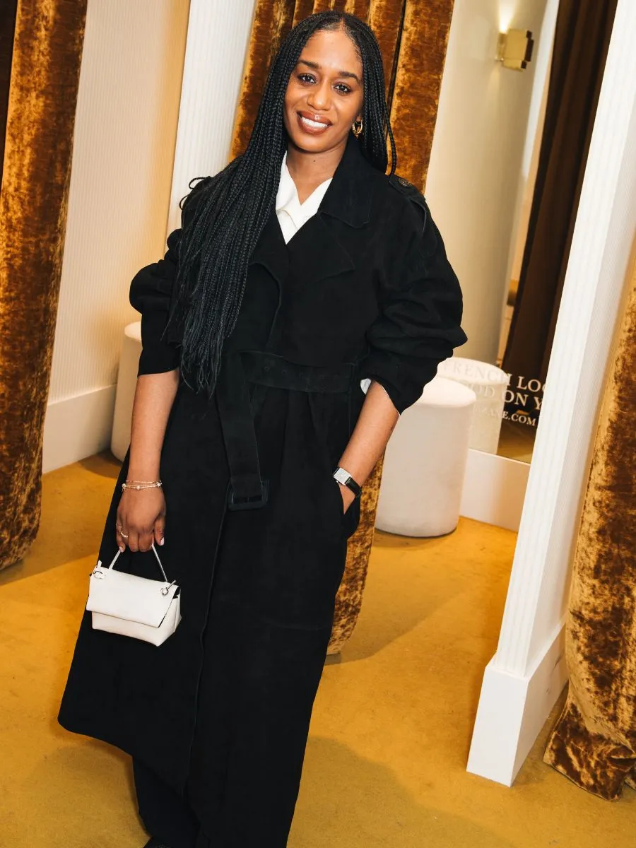
Here. I'm wearing De Savary's Khaki Suede Trench Coat (£695). It's a versatile piece that would easily complement my existing wardrobe, especially as it closely aligns with my go-to shades. Crafted from 100% suede leather with a luxurious satin lining, the coat has an oversized fit and features a buckle belt, storm flaps and insert pockets for practicality. Its rich khaki colour adds a sophisticated touch that would elevate any outfit, whether I’m heading to a casual lunch with friends or dressing up to attend an event.
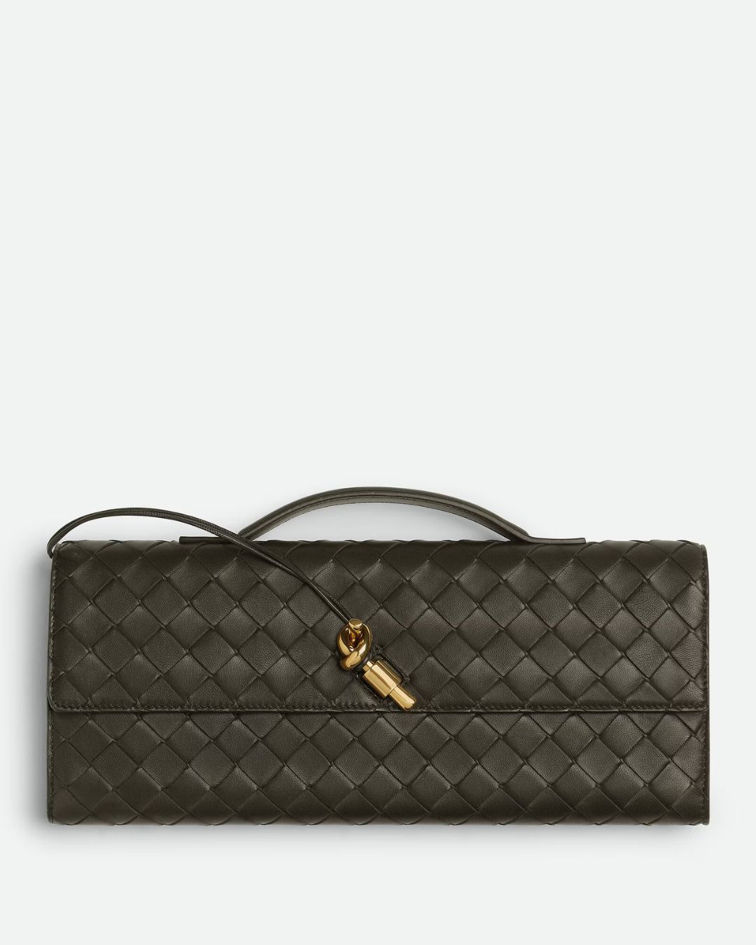
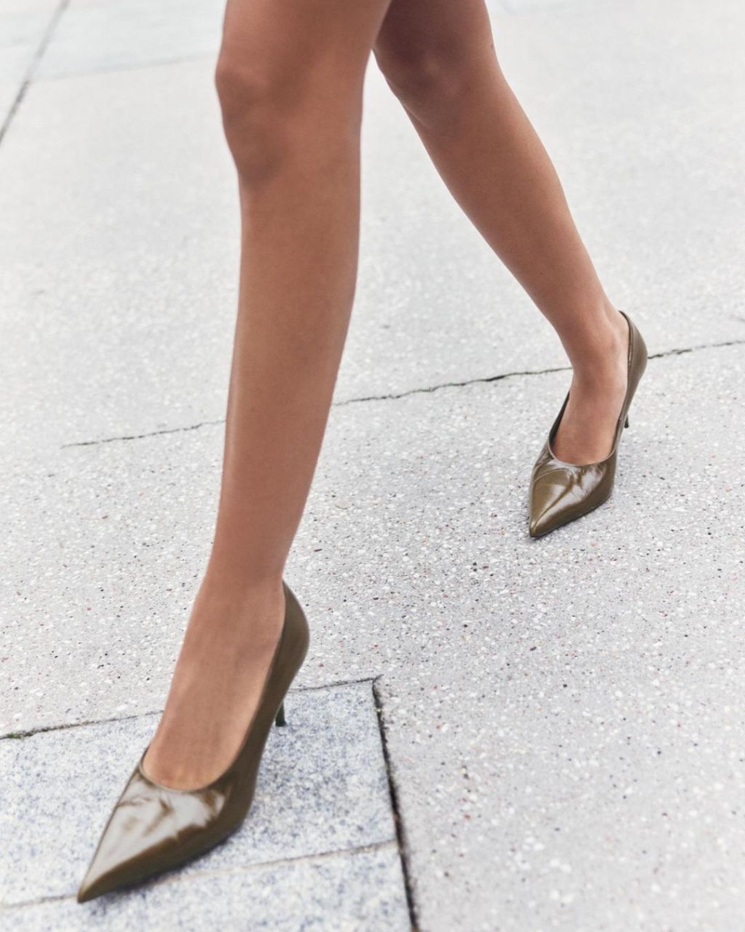
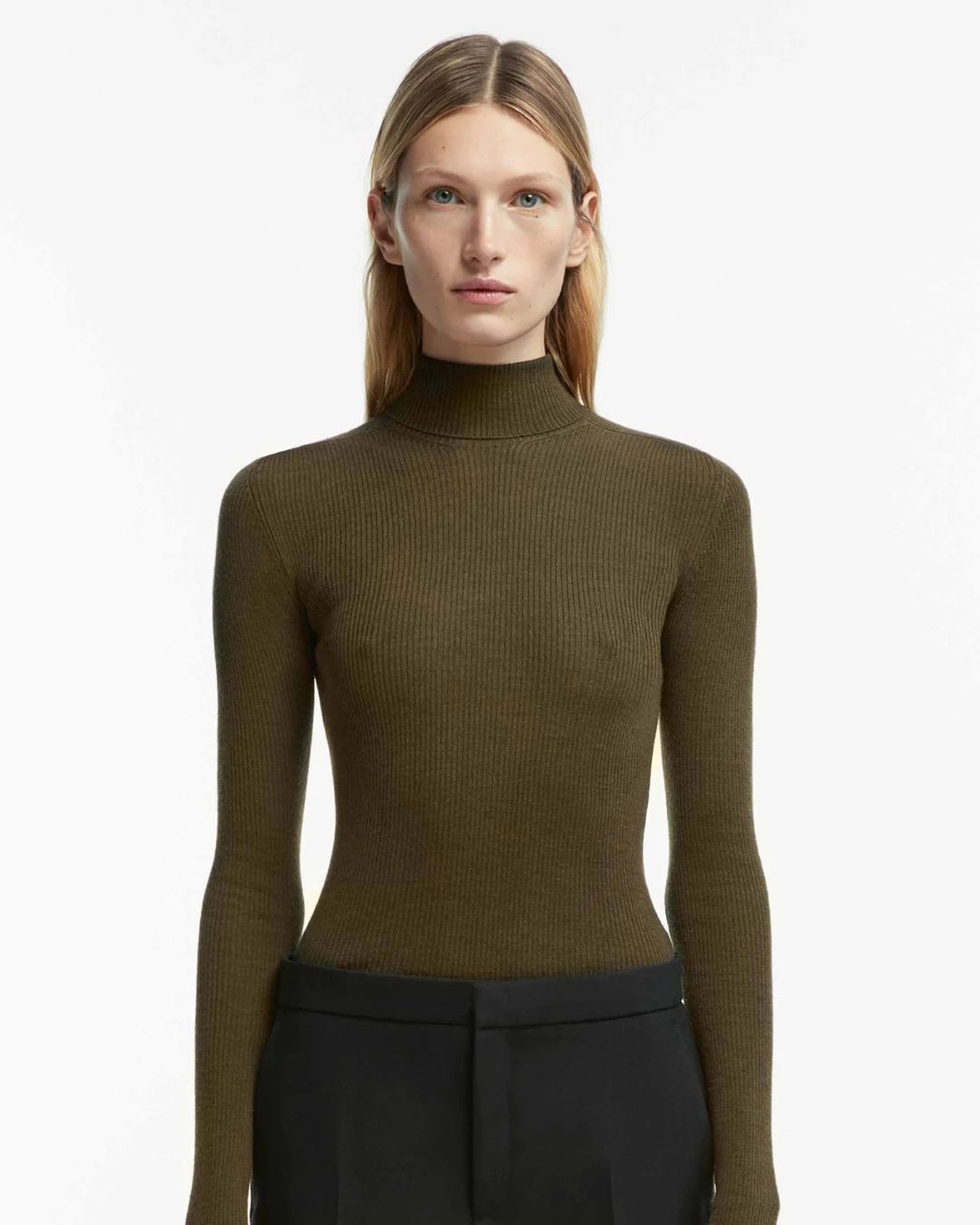
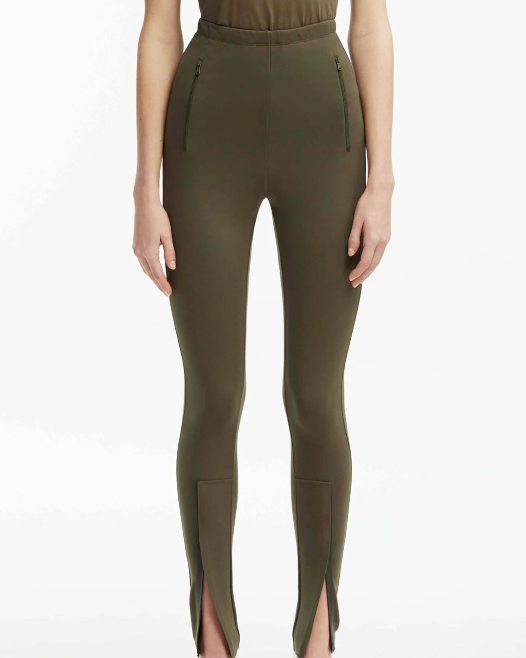
I visited the Reluxe pop-up store in London and was captivated by the khaki zip-front leggings and matching turtleneck from Wardrobe.NYC. Together, they create the perfect streamlined outfit to wear under the statement coat. To elevate the look, I’ve paired it with a pillowy Bottega Veneta leather clutch and sleek stiletto heels from Zara, both of which beautifully draw attention to the striking suede trench.
When curating a head-to-toe khaki outfit, consider investing in a statement coat. Choose a style in one of these earthy tones to seamlessly integrate with the existing autumnal shades in your wardrobe. To highlight the coat’s impact, drape it over a simple, understated outfit that complements its hue, allowing the statement piece to stand out while maintaining a cohesive and refined aesthetic.
